


n that's not even talking about the product!!!!!! lata finder


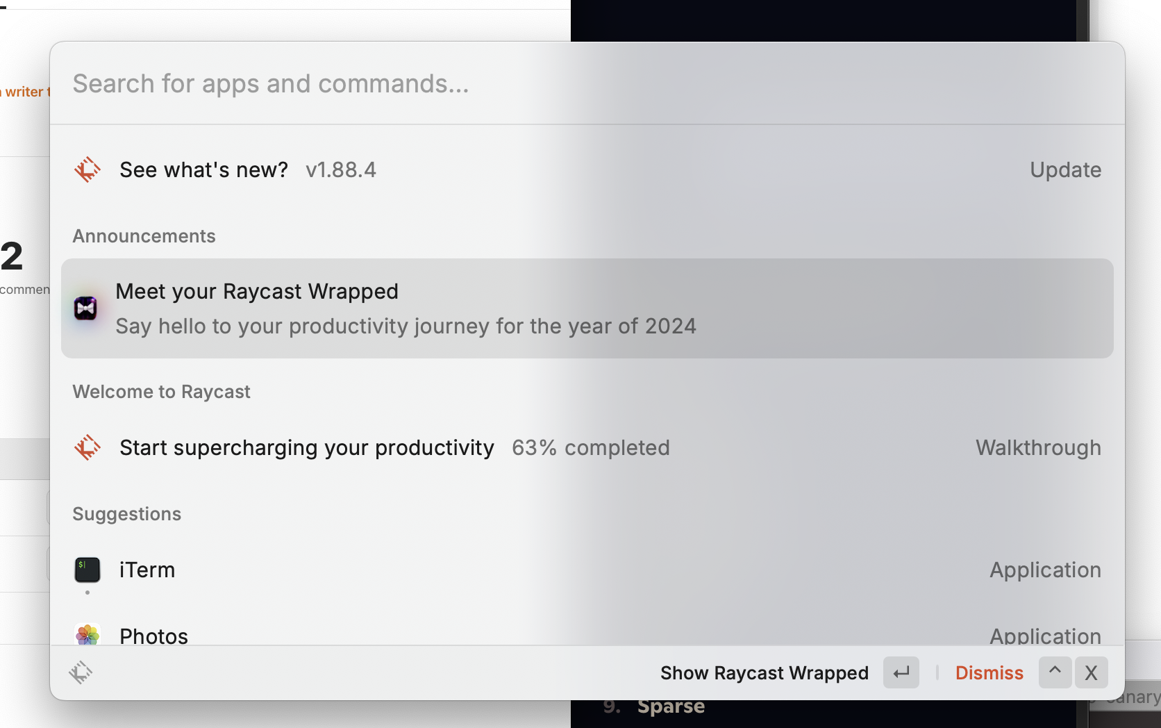
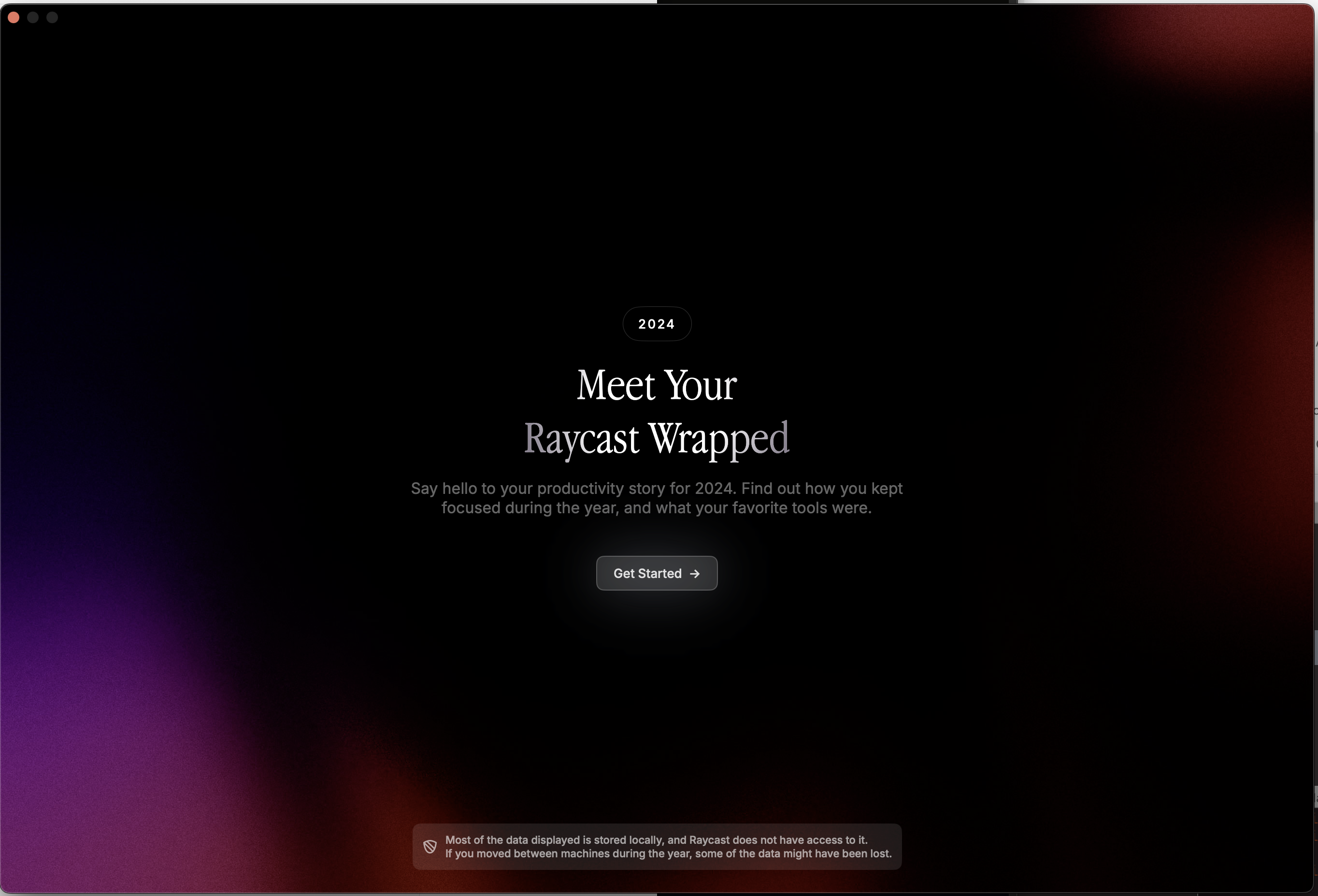
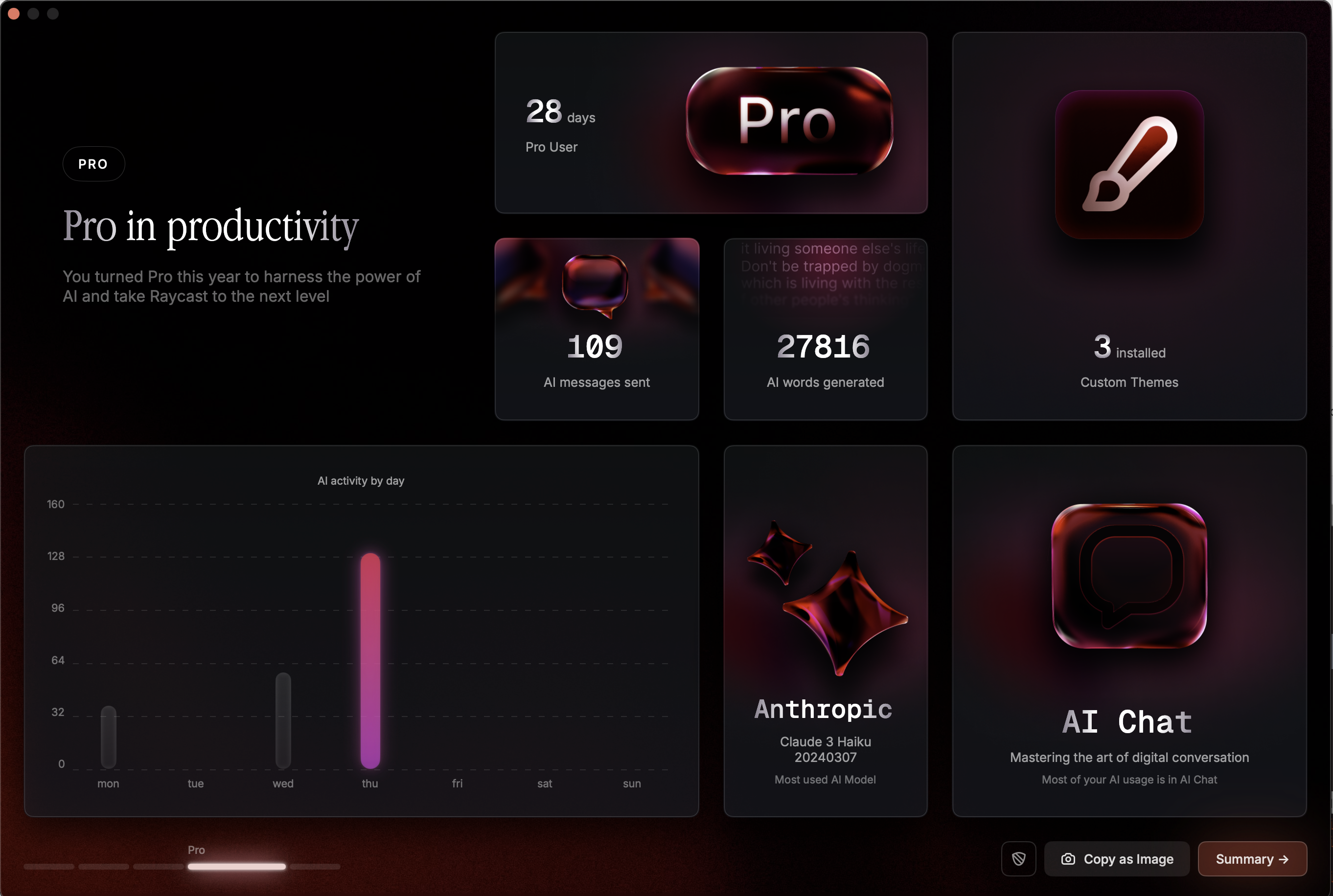
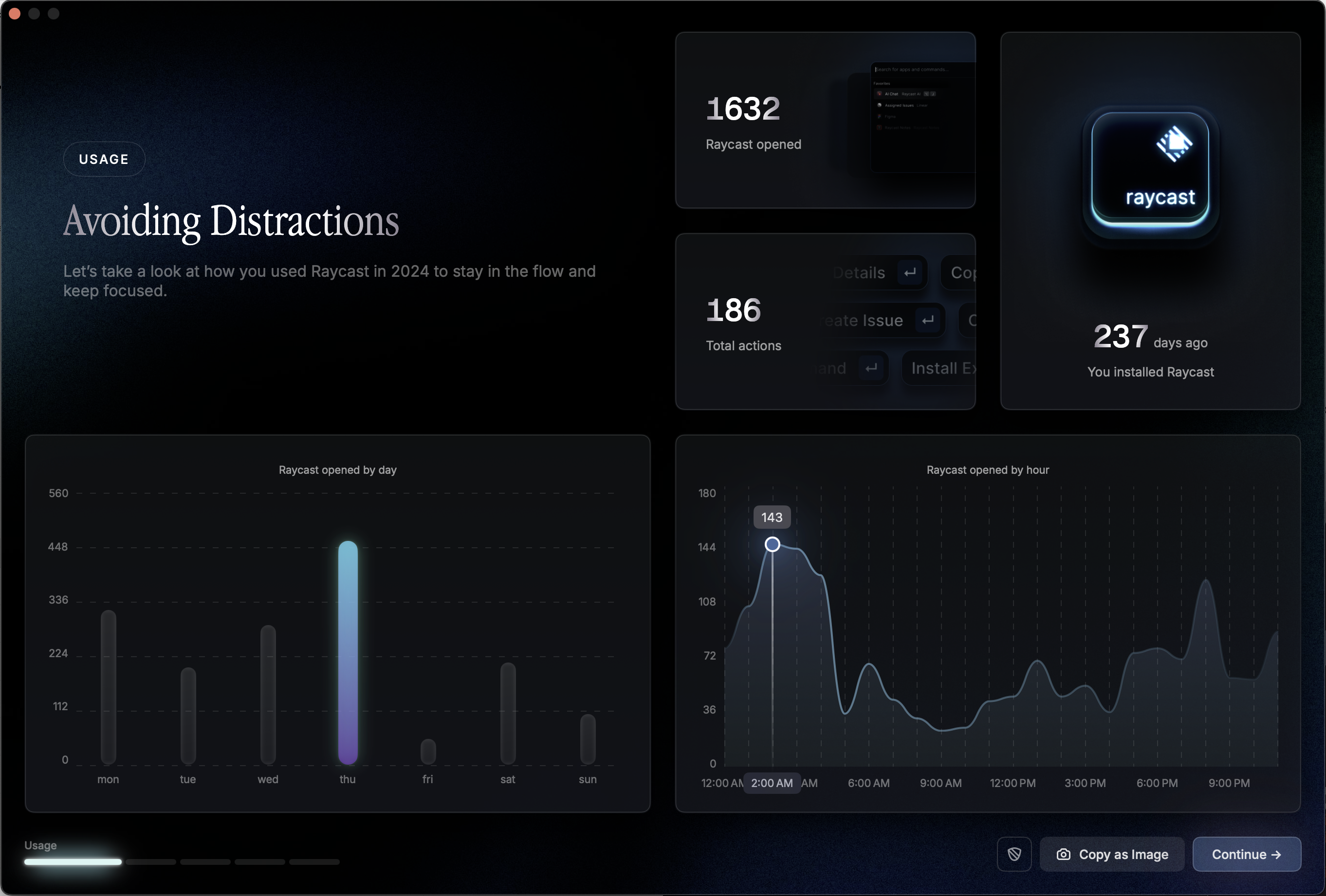
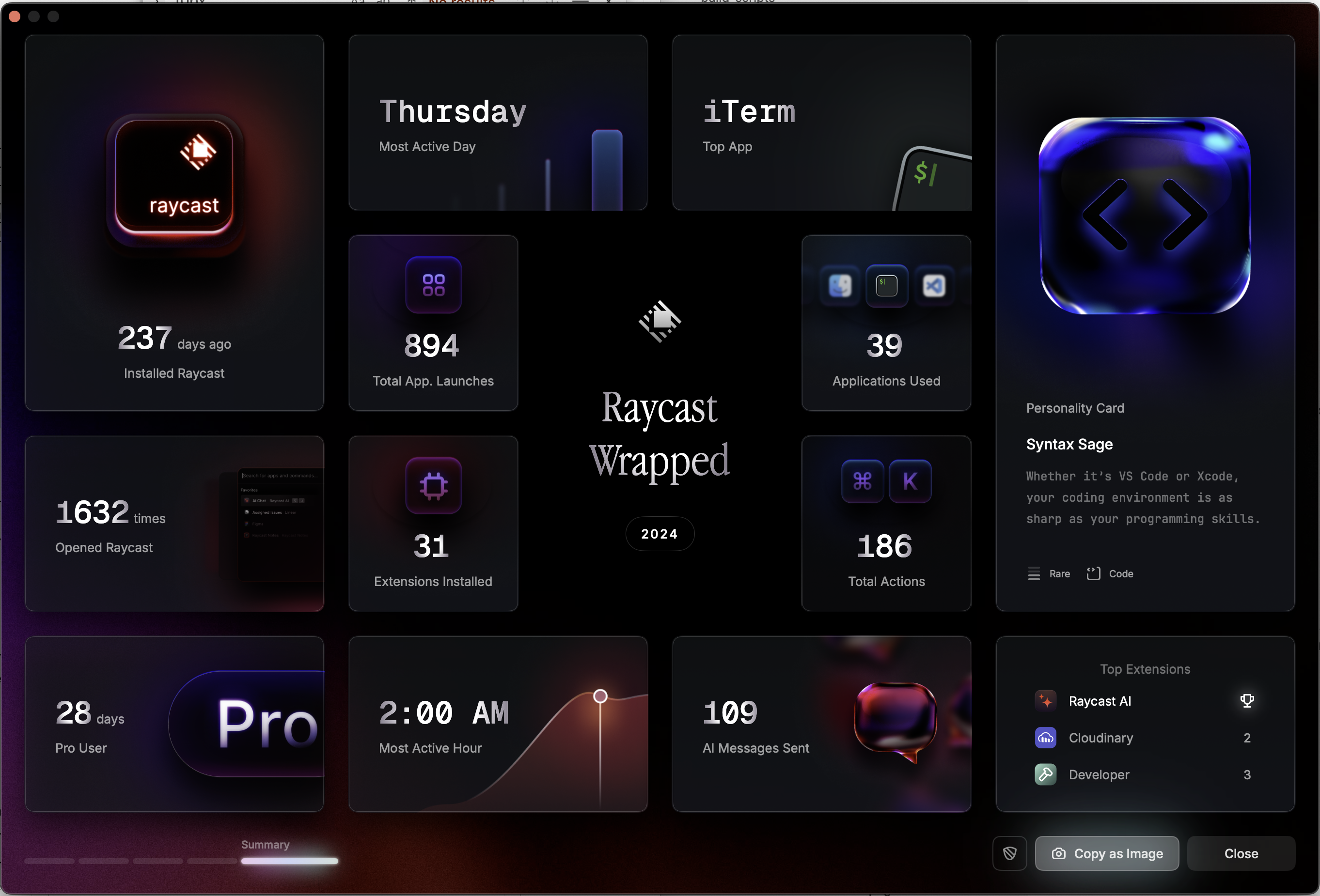
the next time that i came back to this page to update it, it was for "Raycast Wrapped" which is what it sounds like it is, which at first i thought oh that's funny and also dear god a little bit where cue that meme (i always wonder when i write cue about good ole queue, as in cue ball? but queue up the next one in the… queue you know? and i look it up, and i think i'm wrong, but am electing to move on) where everything has a "stories feed" eg cvs app, but it actually is pretty full of useful information from which u can gain some insights into commonly, and thereby extractable, actions and what u spend your time on (after I cancelled my rescue time subscription) and ofc, the design goes bonkers:
the fact that most of them are still running is mind boggling and i always delete all of my css files for personal projects when i happen across this aesthetic ugh
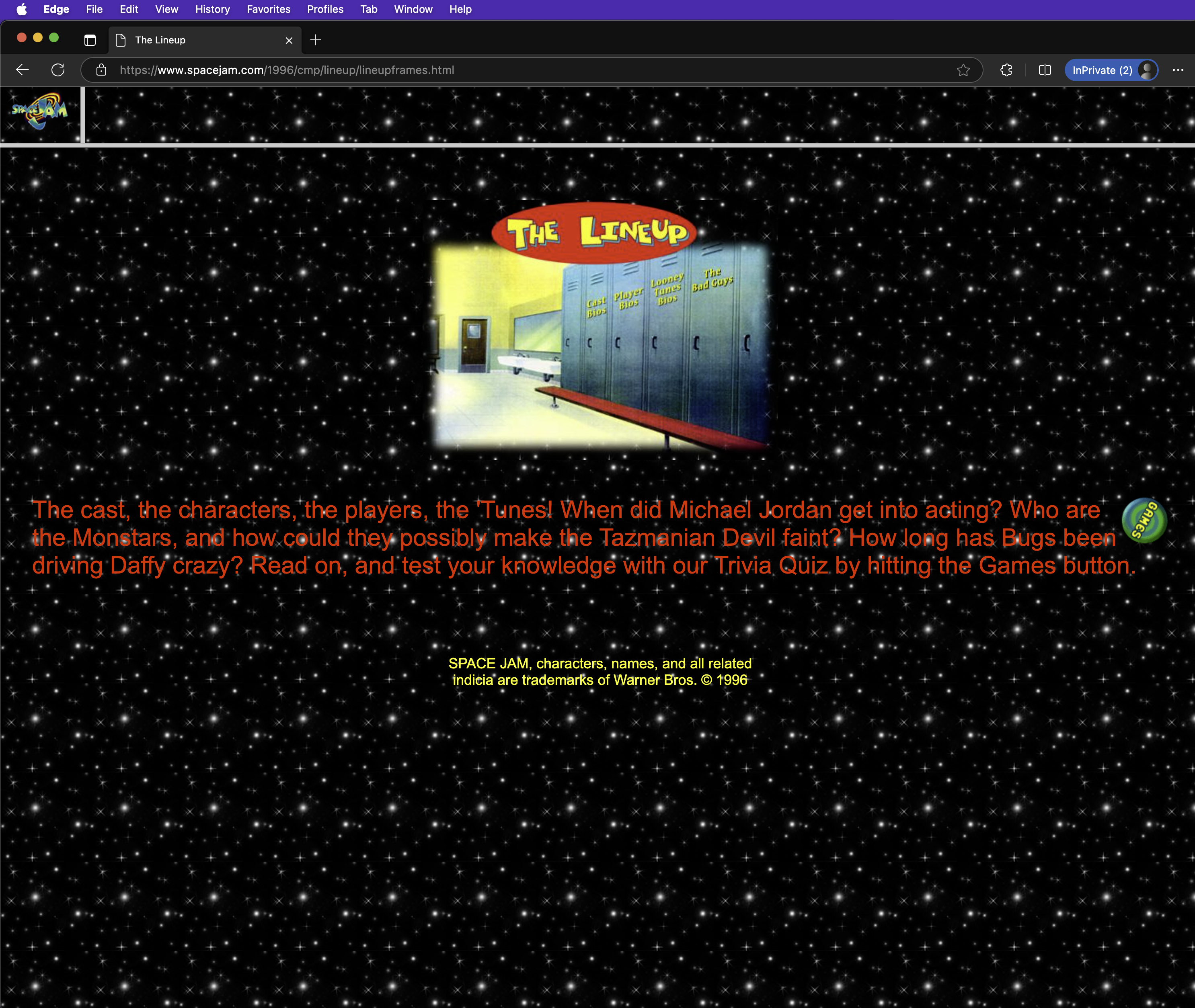
also, the first official spacejam site (and, lesbianas, probably one of the last too) is crazy cool and is basically like AOL whatever that walled garden style thing was an internet unto itself… games, a feed, a list of radiostations that might play the SEAL song if you're lucky l o l:
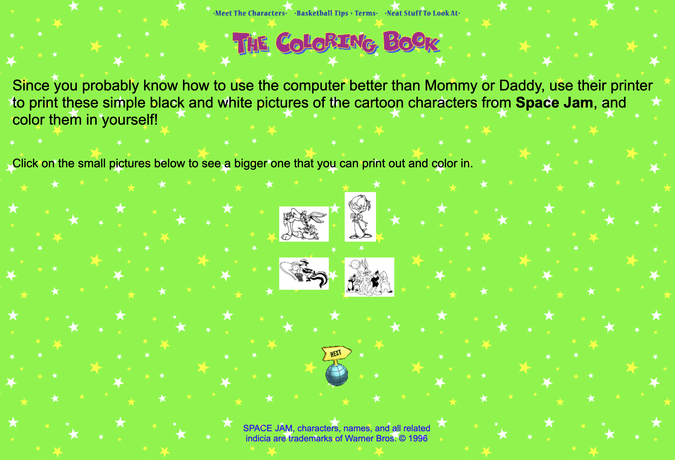
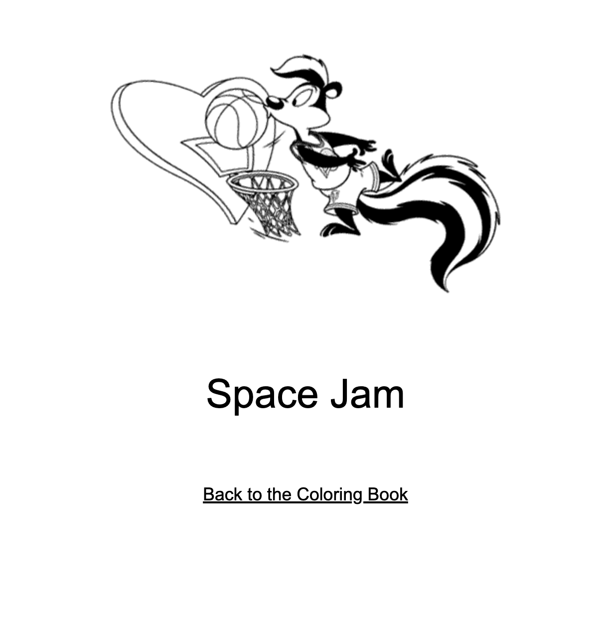
printable color book pages
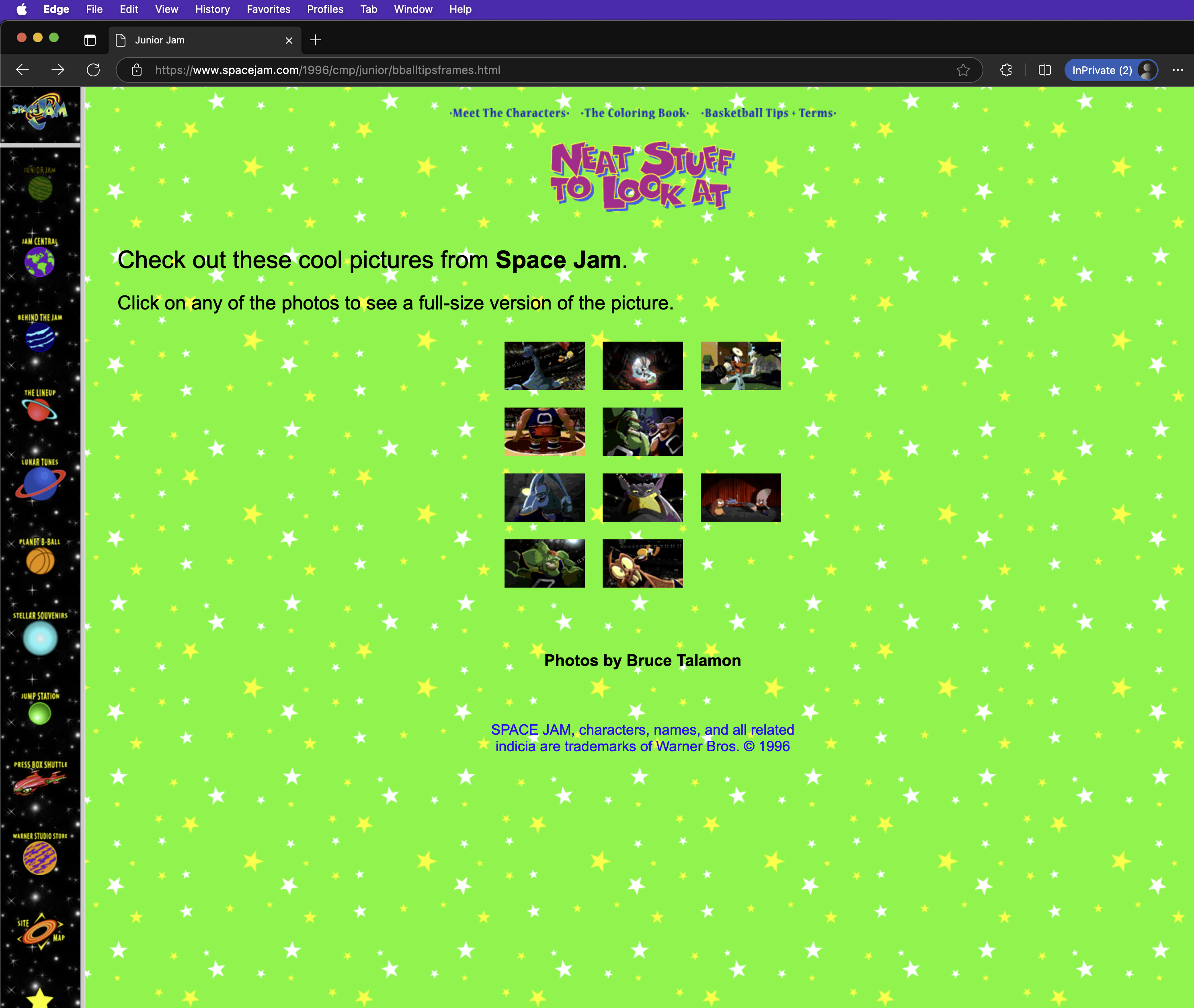
neat indeed
a games section… and? even the games still work, except for flash, what is flash like actually, i want to know but also don't know if i want to bother looking it up
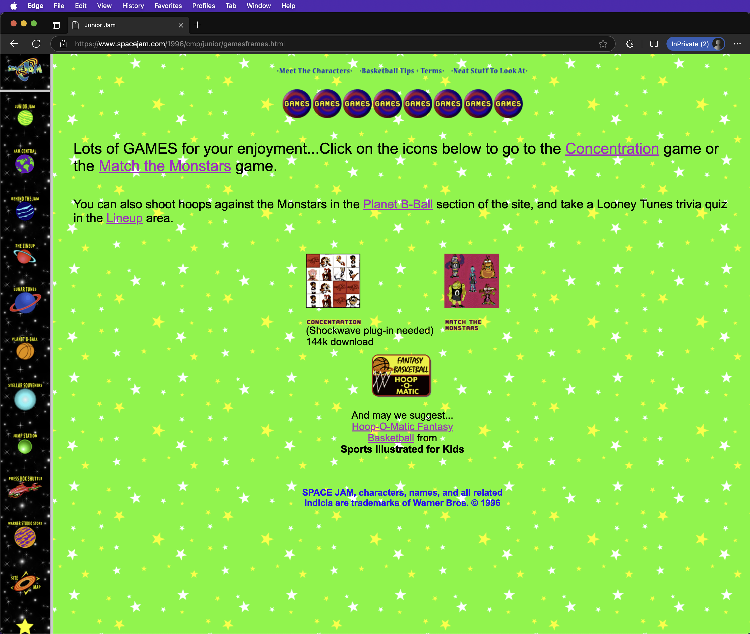
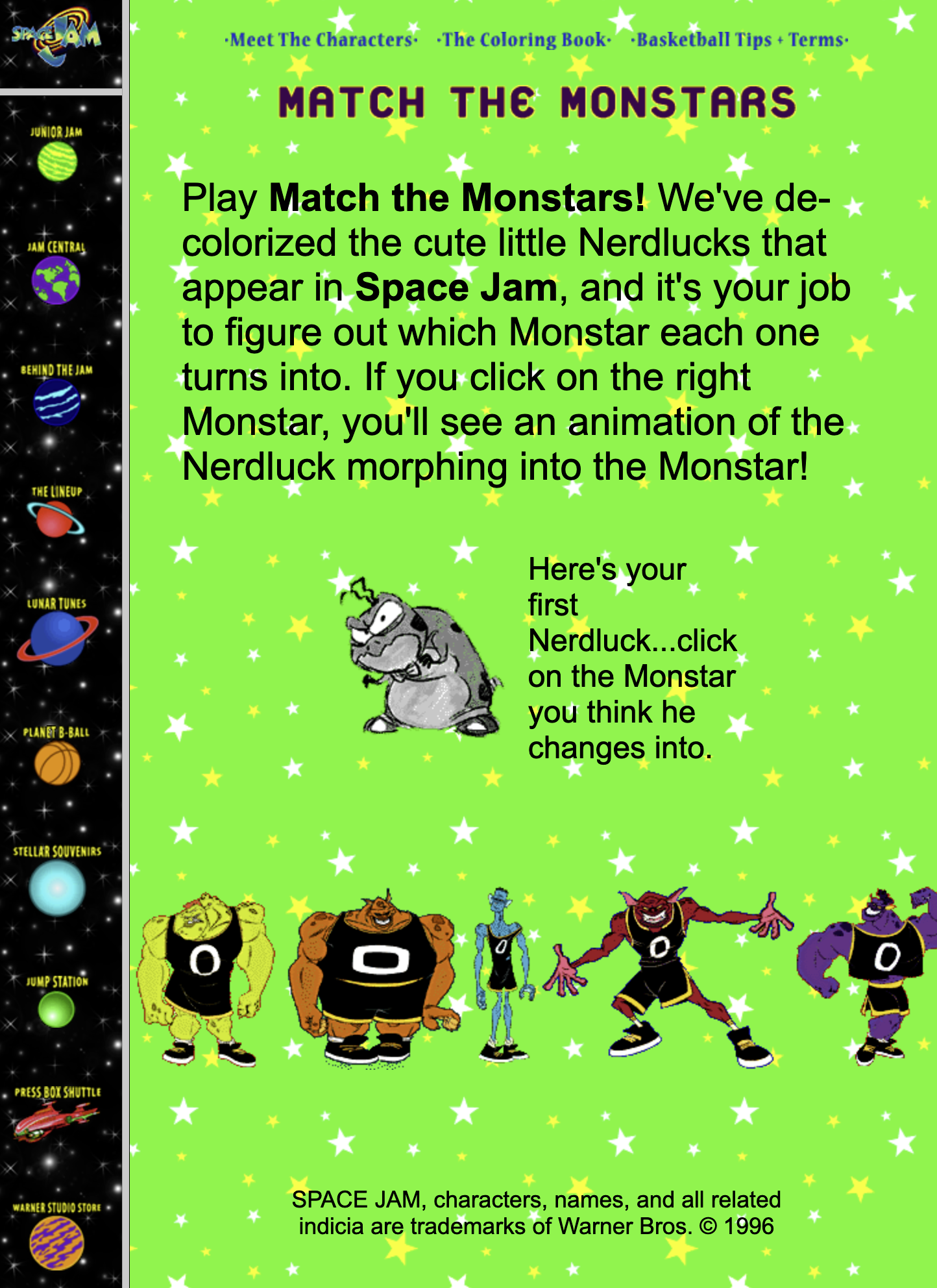
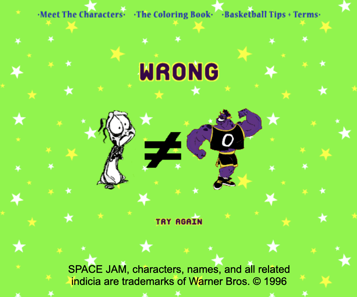
ok last spacejam, radio listing, lmao
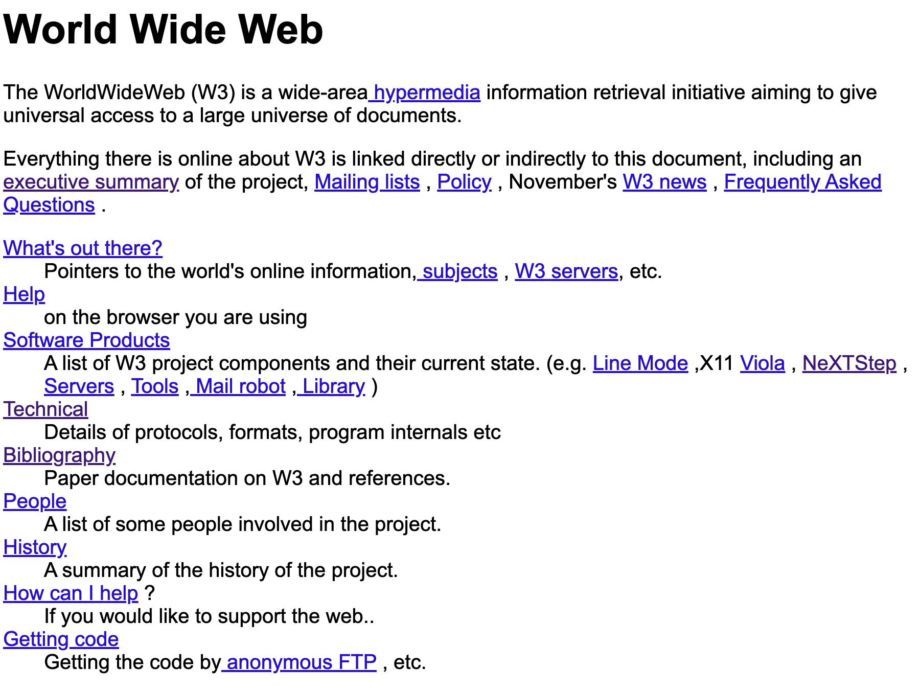
first site ever
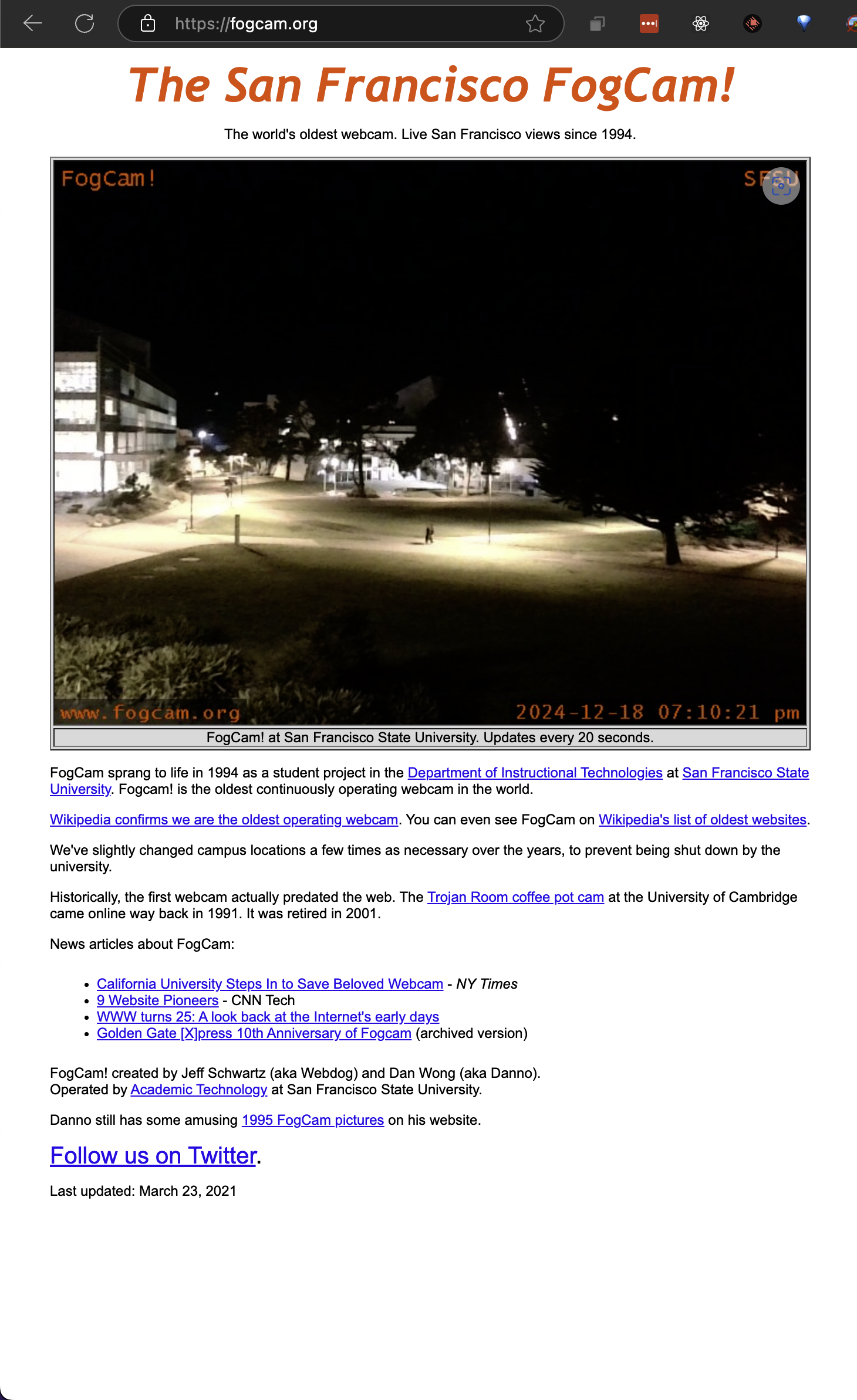
first webcam ever, still functioning (see date in lower right of the image) / imagine learning that someone was seeing a frame of a photo of you from a hidden camera on campus when walking back to dorm in 2024


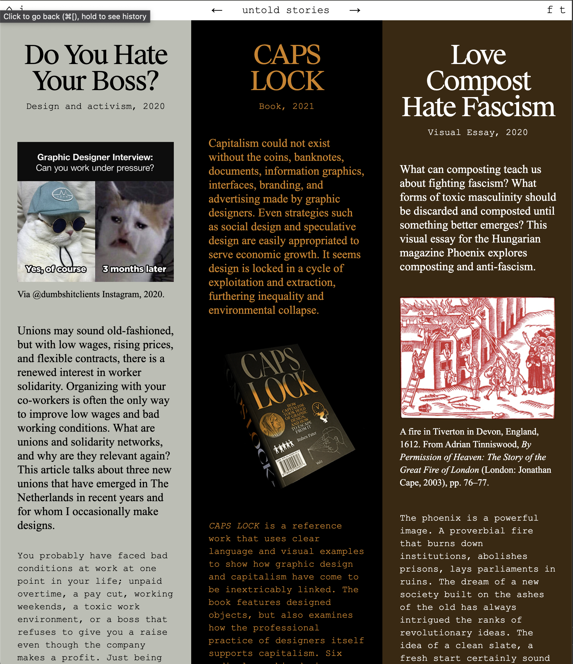
Terrible phenomenon depicted terribly gorgeously:




well, #1 you would think figma's site better look sick, given that it's figma, and, it does! but also i'm getting worn down on whatever this style is… modern pastel border-radius bold color chunky?
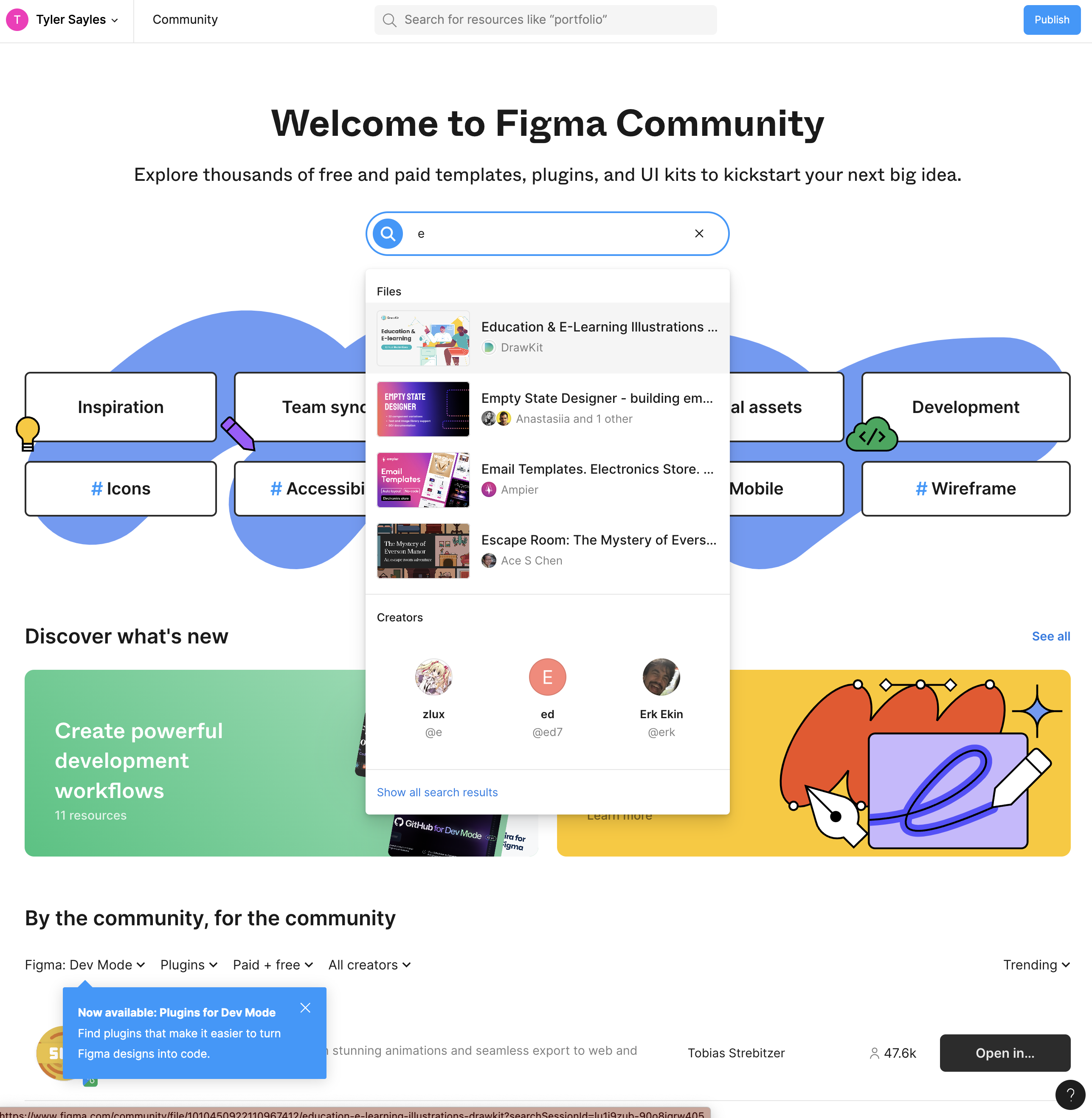
but anyway, look how many cool ass community plugins they have:


after giving up on pinterest whenever their lil paywall would appear over last ten years, i finally took the grueling 20s it took to make an account in order to better help my man envision my vision. the vibe i wanted was monica belluci's house in the matrix meets bjork meets Jlo's concrete home in Enough. A movie i used to watch whenver it was on which was often. Doesn't disappoint. Anyway here are my inspos and here were some standouts.


https://www.webdesignmuseum.org/all-websites/year-2000
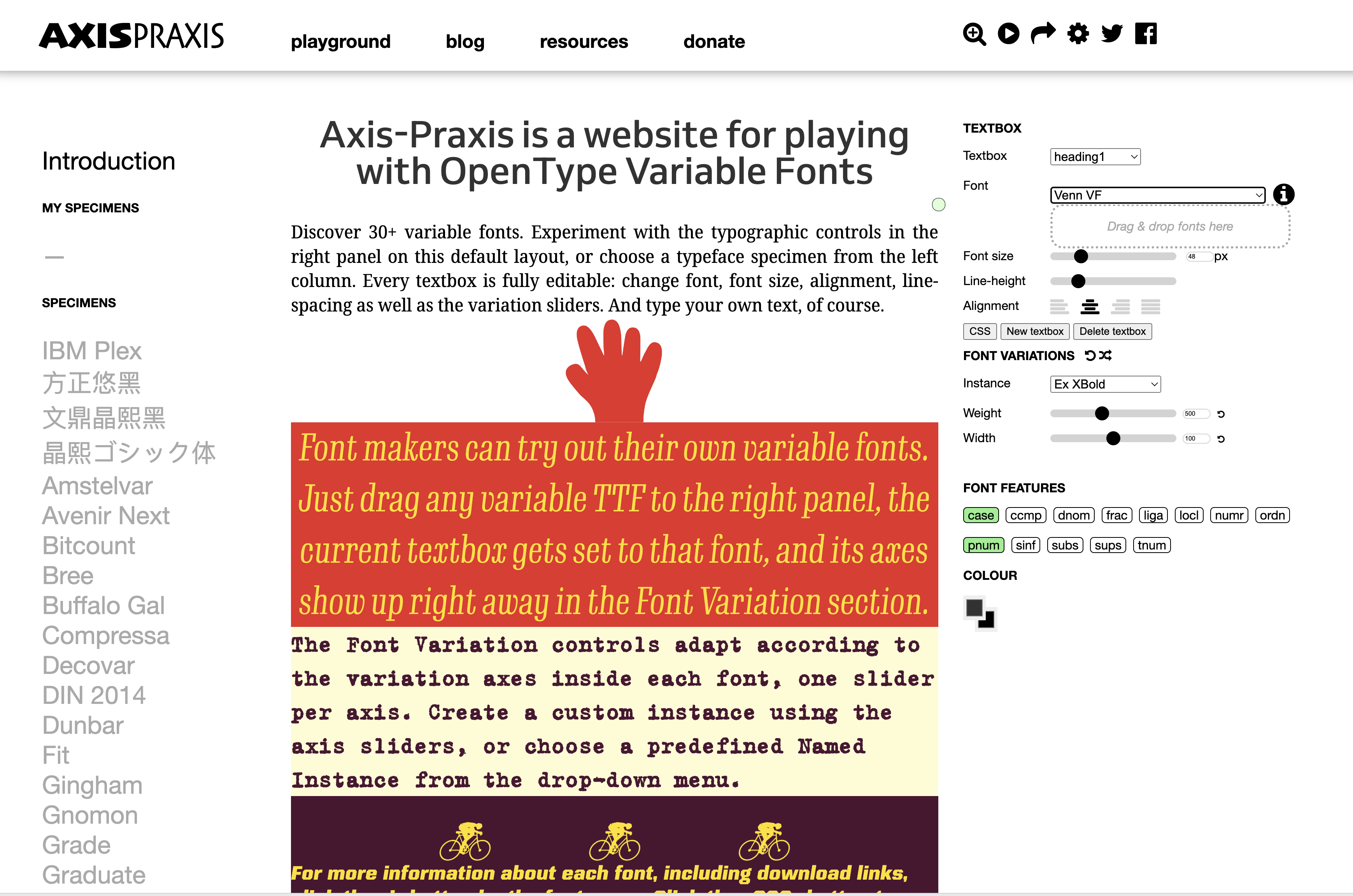
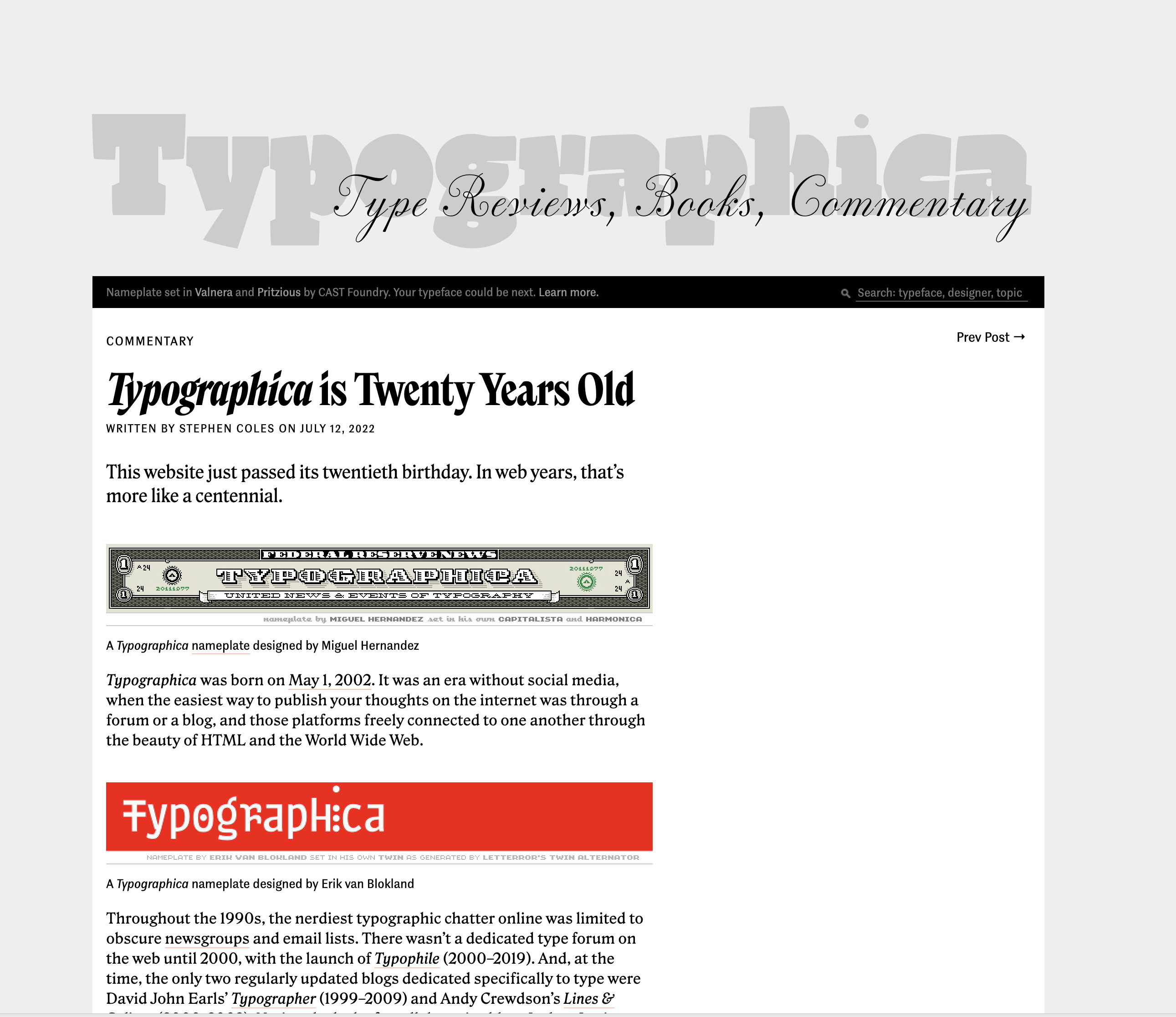
I inspected this sick publisher's site to see what font they were using.


That font was then found here… 1. all their fonts are sick, 2. all their font-demos are even sicker:
O, and the original also linked to this really sick blog:

…as evidenced by all these random but similar images in my dev dump cloudinary folder… you'd think my task was to save a photo for everytime i encountered purple on a site:


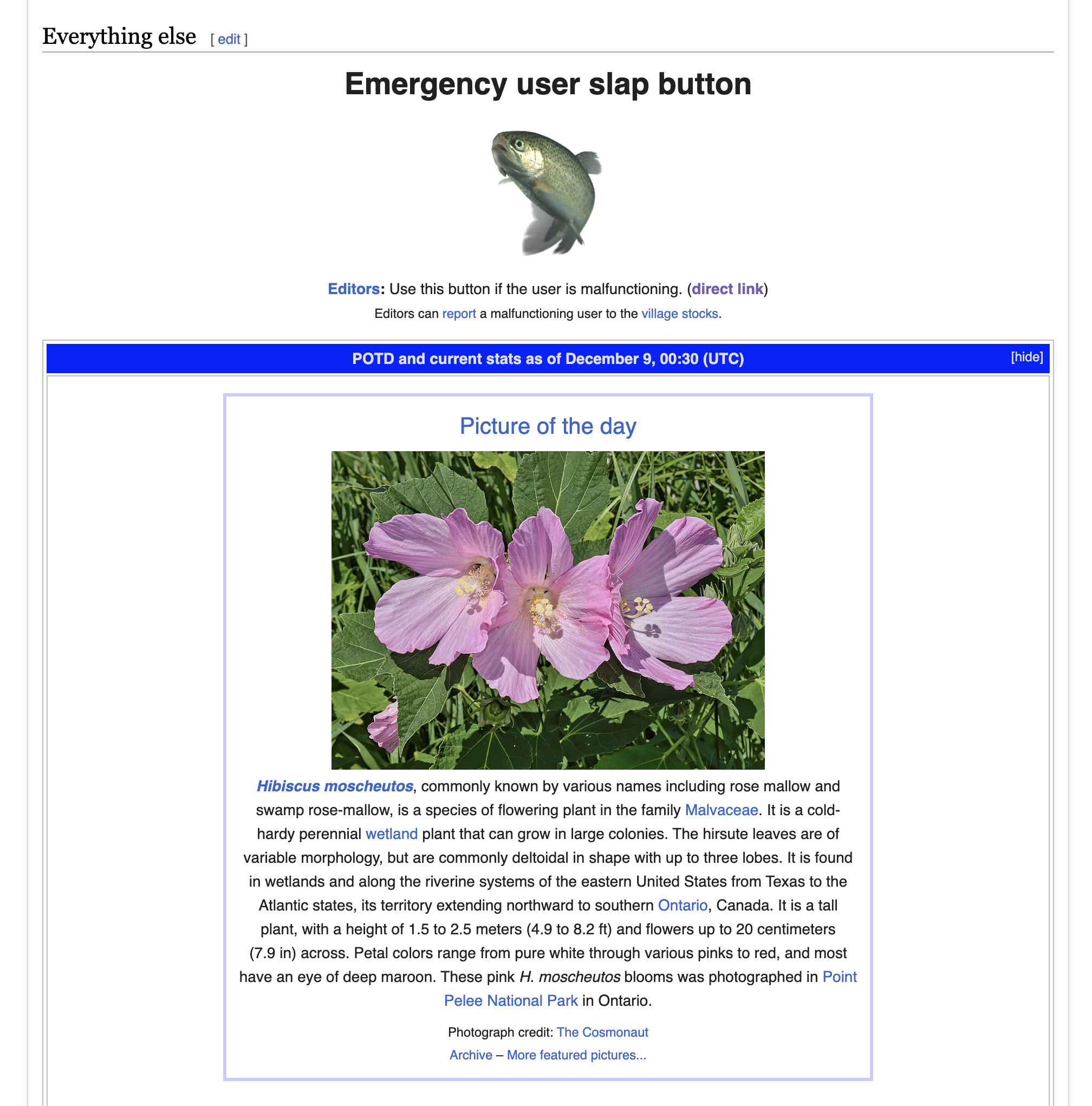


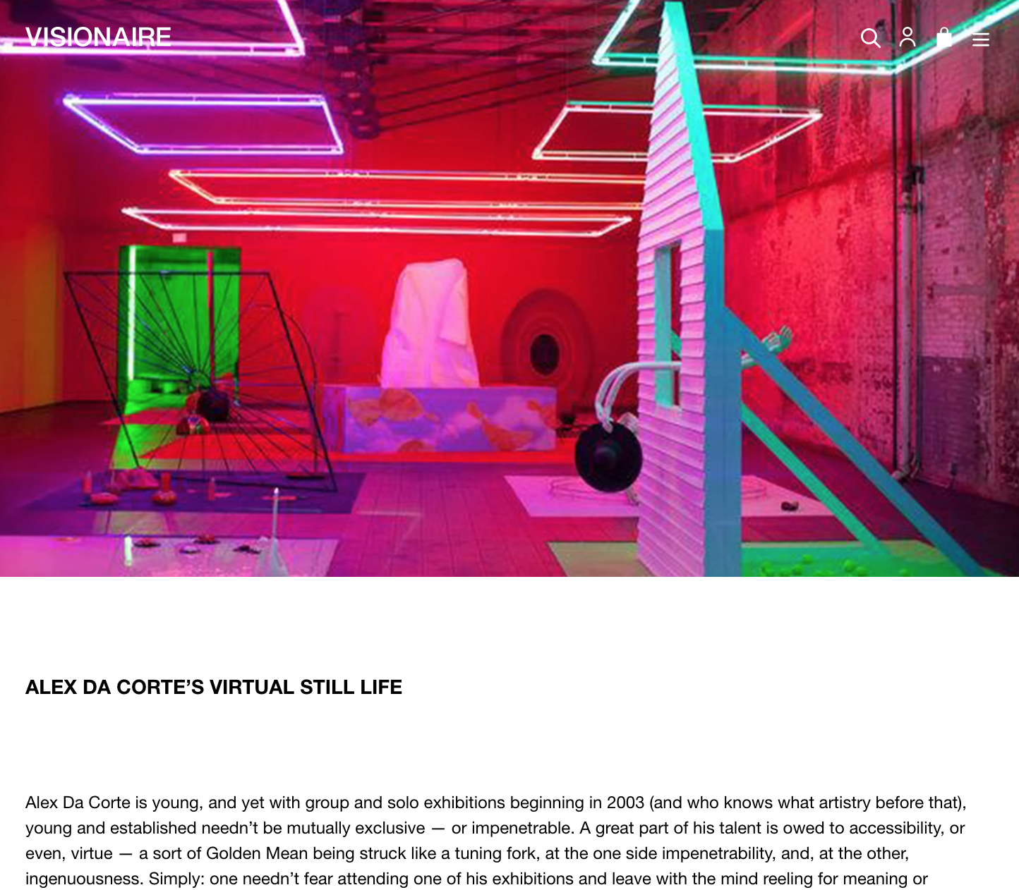


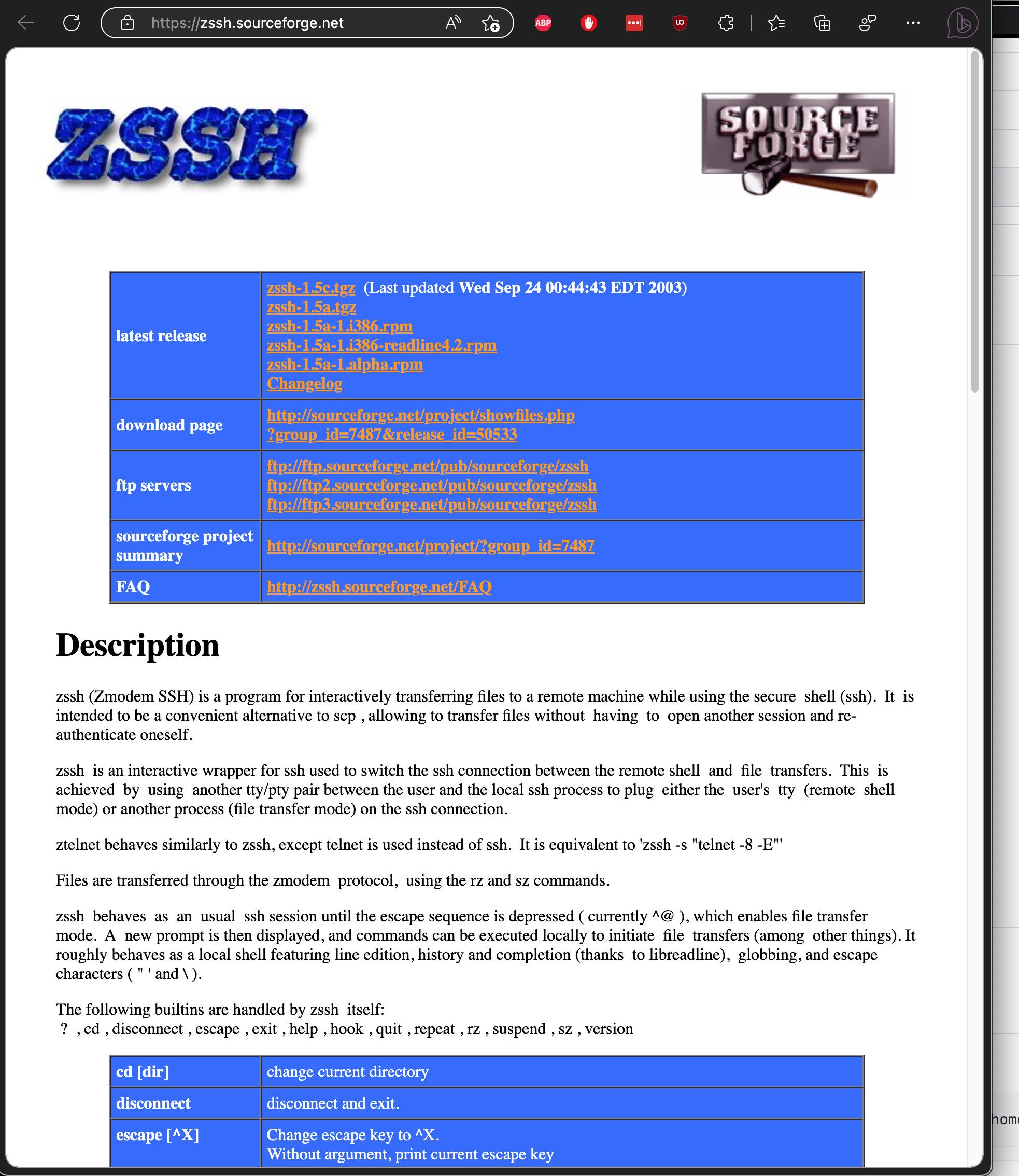
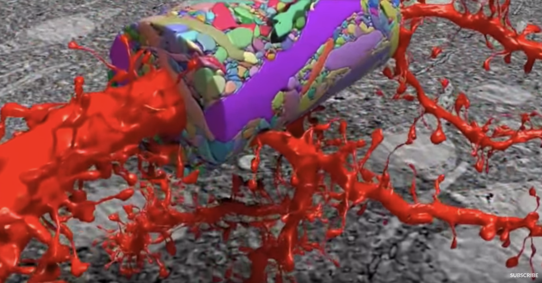


what i call blue purple (scientific name)
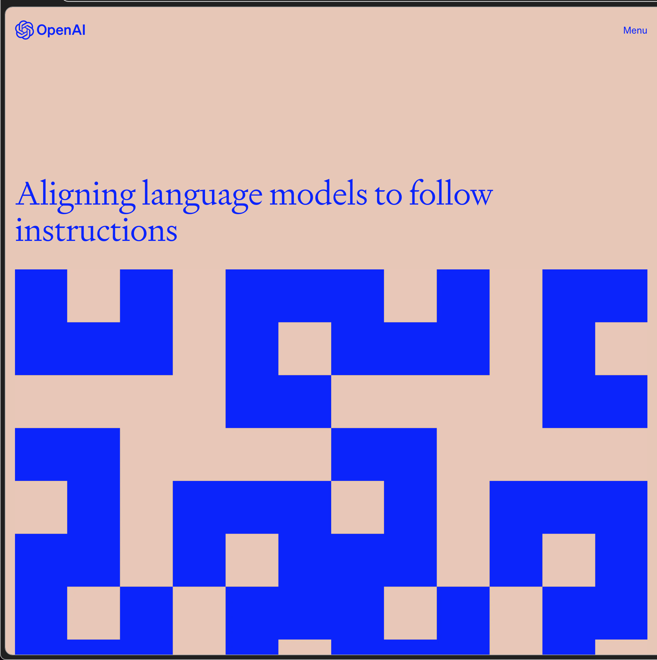
super sickly name for a software + purple:

cherry on top, me at my first job in nyc, w/ purple ok pink border

Lookin for a new style, a new hair du, a new cut, a new calah. Design resource compendium. Lots of cool stuff.

p much all the stuff slew

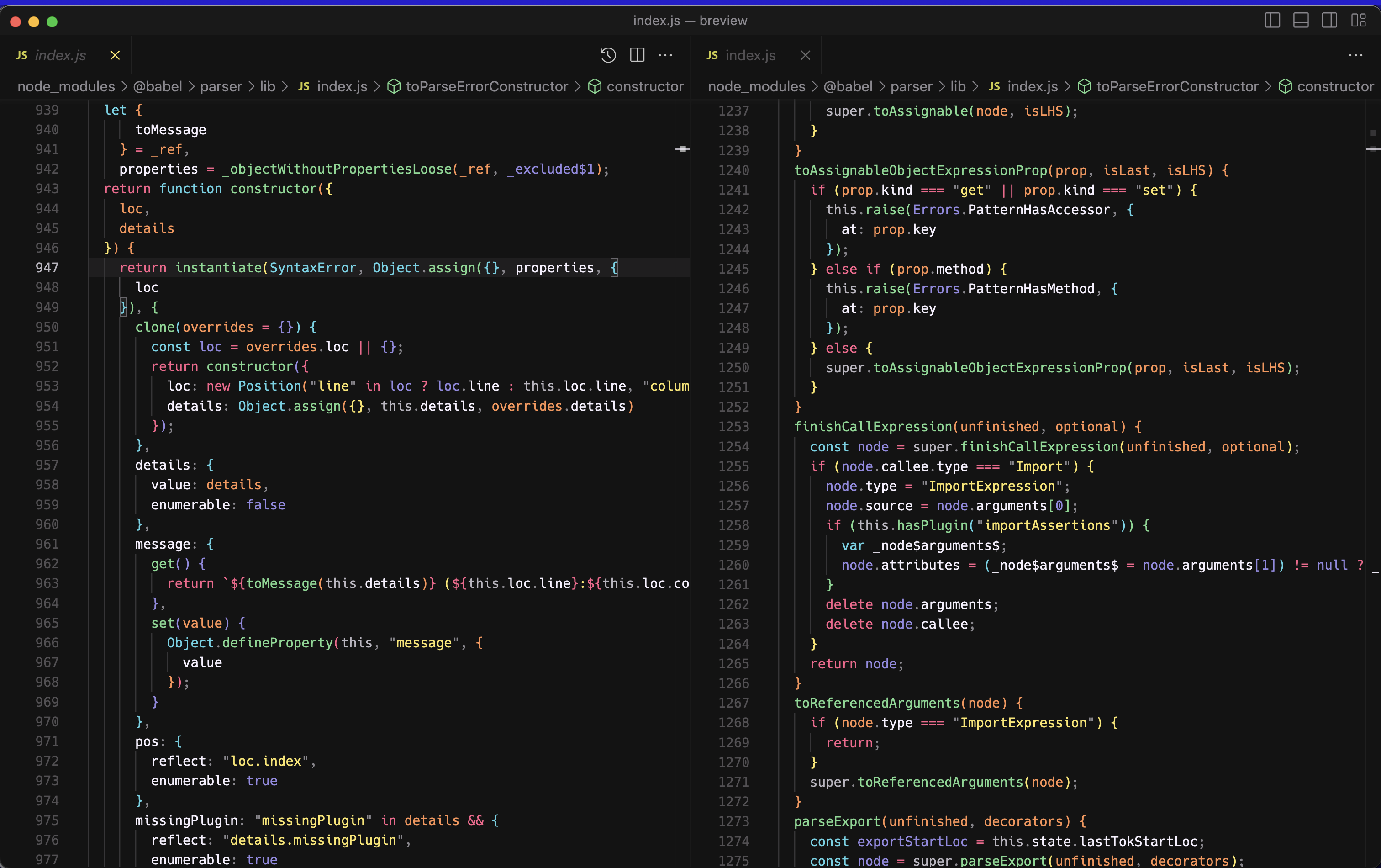
a code editor and whose colors r a balm to soul:
if Thomas Pynchon doesn't publish another book b4 i perish i'm gonna resurrect and stalk; in the meantime there are about a trillion fan sites and their graphic design is molto bene:
This one gives me Gwern.net level geniuses, this guy is up there. He, among other things from cursory glances, is into electronics, waveforms, you name it, and also ofc aggregates annotations about Gravity's Rainbow by Thomas Pynchon.
Take this random page

Or, click around for a little while on the hyperlinks, which it is hyperlinked to hell, and you'll be taken ton sophisticated electronics and other cool stuff:
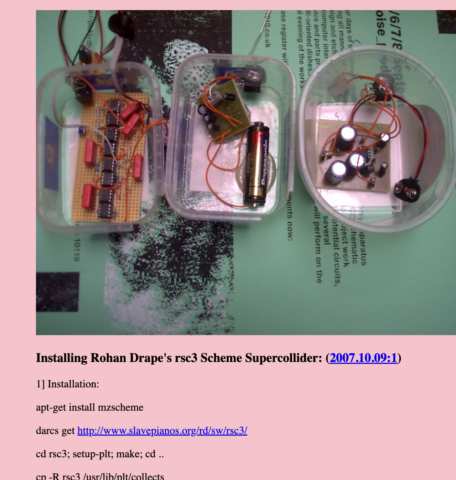
https://www.1010.co.uk/org/autotate.html#fnr.5
Or go to the root domain of their site to be exposed to their even more expansive CV… presence of greatness and madness vibes.

And then on top of that just some gorg prolific art… and here I thought special for reading all his books and have 100 pages of annotations or less.

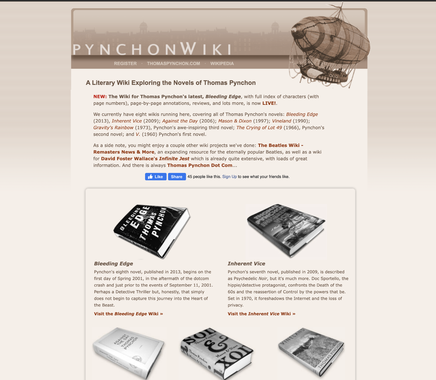
Maybe I'll do a lil montage and have some of my old embarassing journals and hyper annotated copies of his work :weary:
omg what on earth is this
http://pinggod.com/landingpage/
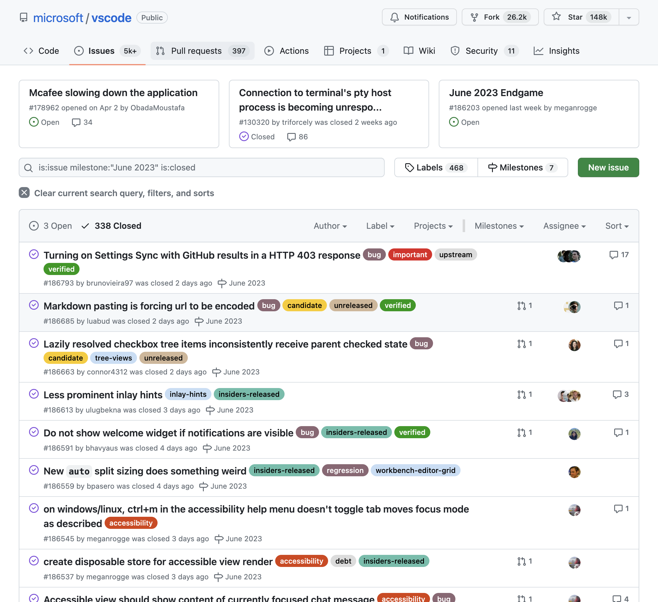
A lil dramatic and funky but no one could say ineffective.


All the standards websites are gorg.
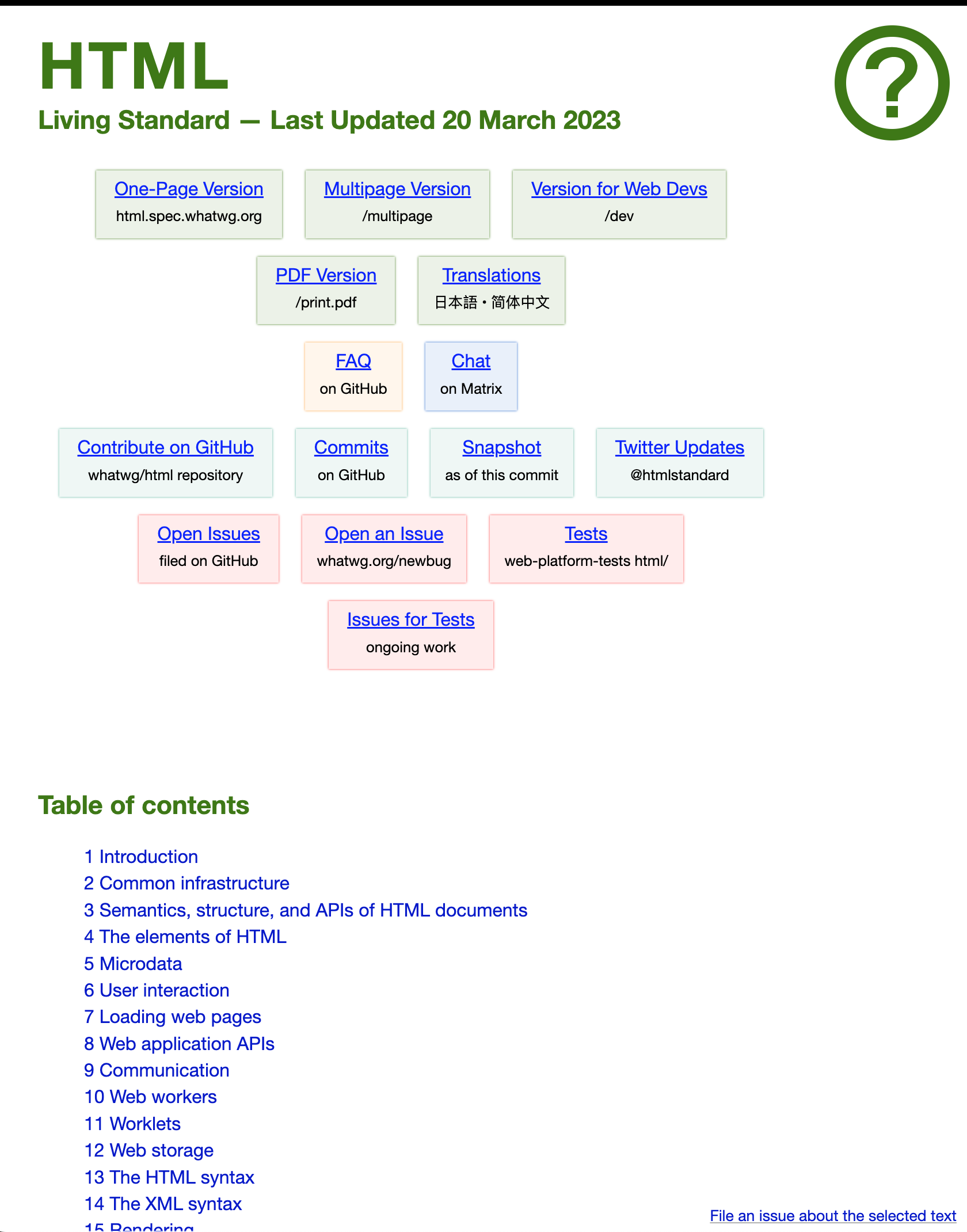

I wonder if this is a trend that in 10 years we'll look back on as something so dated. I can't imagine that currently, but alas, can we ever (80's big hair, or mullets, or The Rachel). That's to say that I love the glow / "steamy shower door" effect. Here's an example of from pinia's documentation:

And here's another from a nuxt starter project when you have a TS error, much more friendly than the terminal-style:
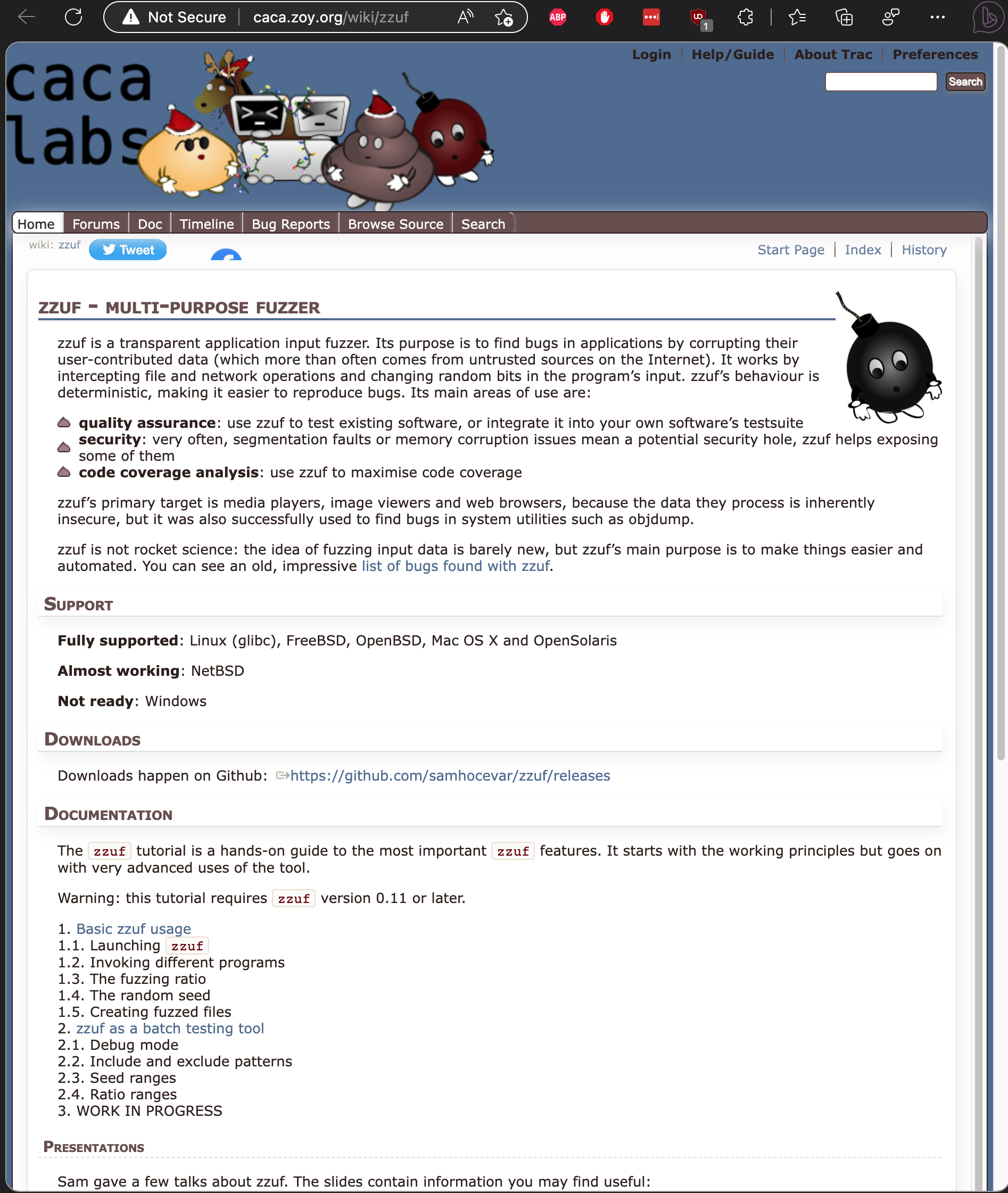
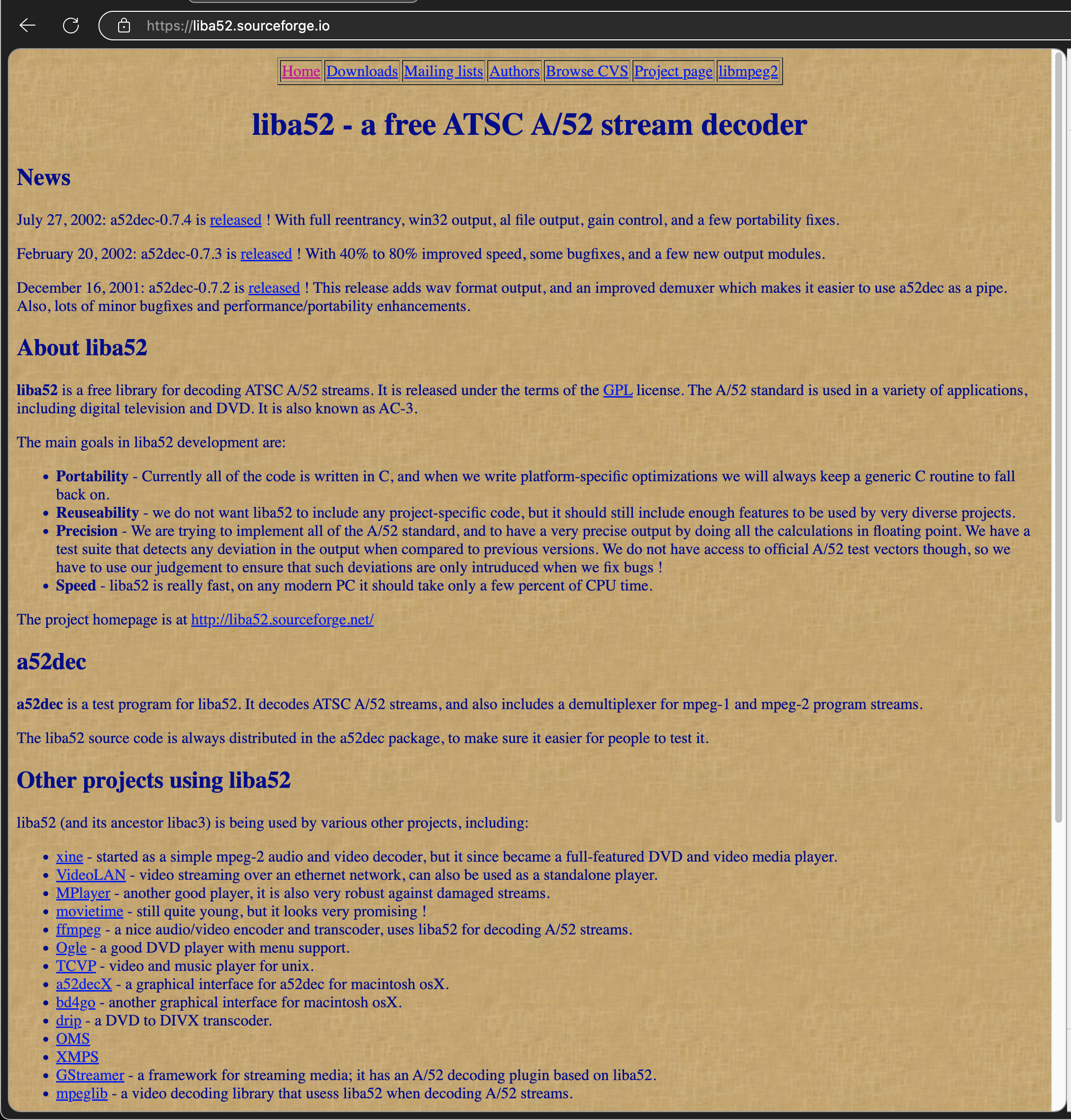
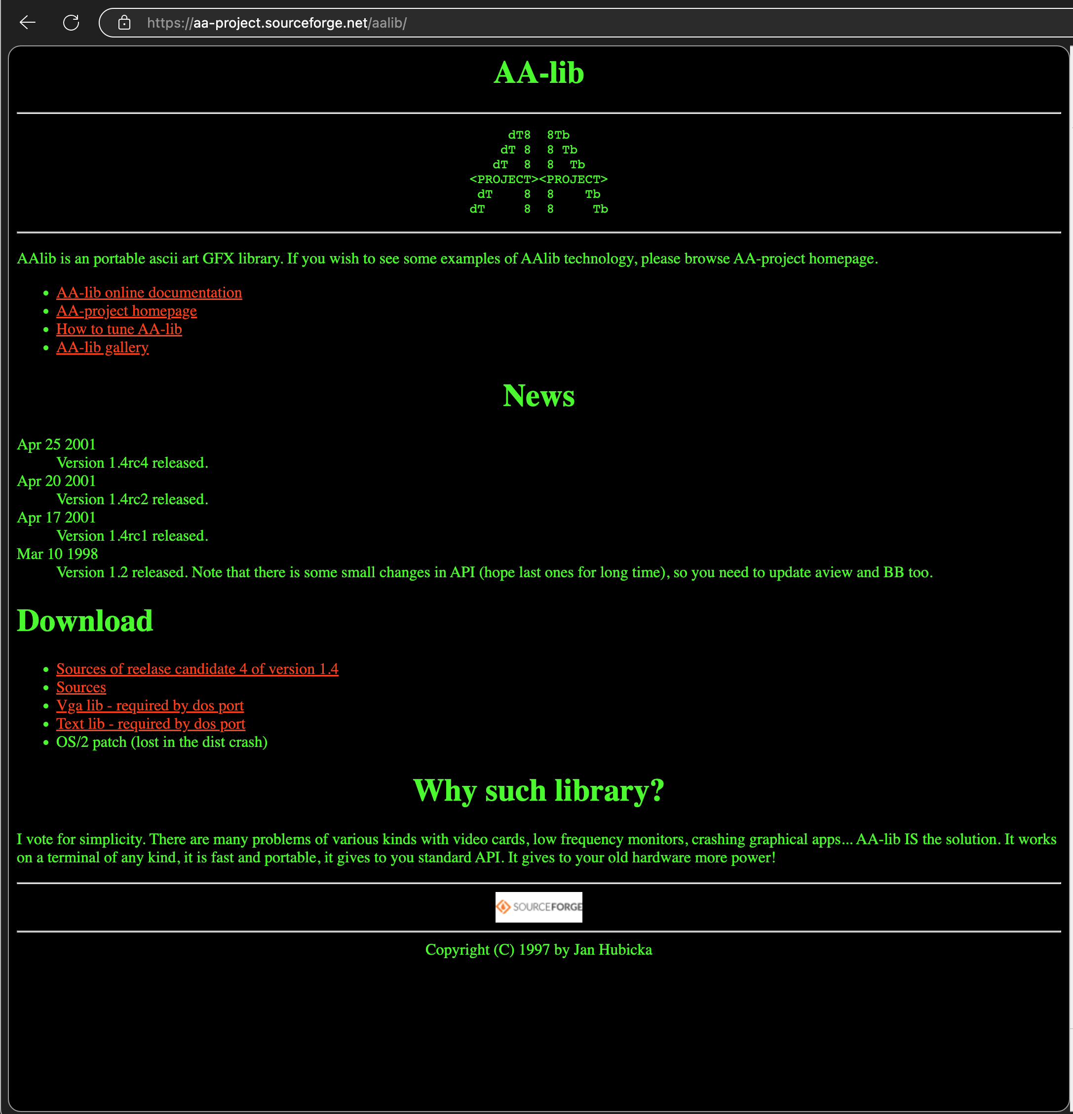
Came across this very serious and insanely complex site when I was looking at a link in the sonarlint extension (which deserves its own post)… but anyway, love the design, snark, and general neckbeardery. Particularly ominous is the subsection on "behavioral issues". Can u imagine getting an argument with lvl 300 mages that admin this site?


The dedication is crazy tho. This is just one tailored subsection for the top 25 of 2023 CWEs, by which u can sort per yer area of interest:


I'm making this thing breview, homebrew preview, and each formula has a homepage key. Most are as cool and classic as you would expect:




So I was looking at what other tarot cards looked like and check this out:


the for some reason I clicked talk/edit section at top of page and you find all kinds of amazingly designed color palettes, and peeved out editors… not even sure what this is for but I want it:

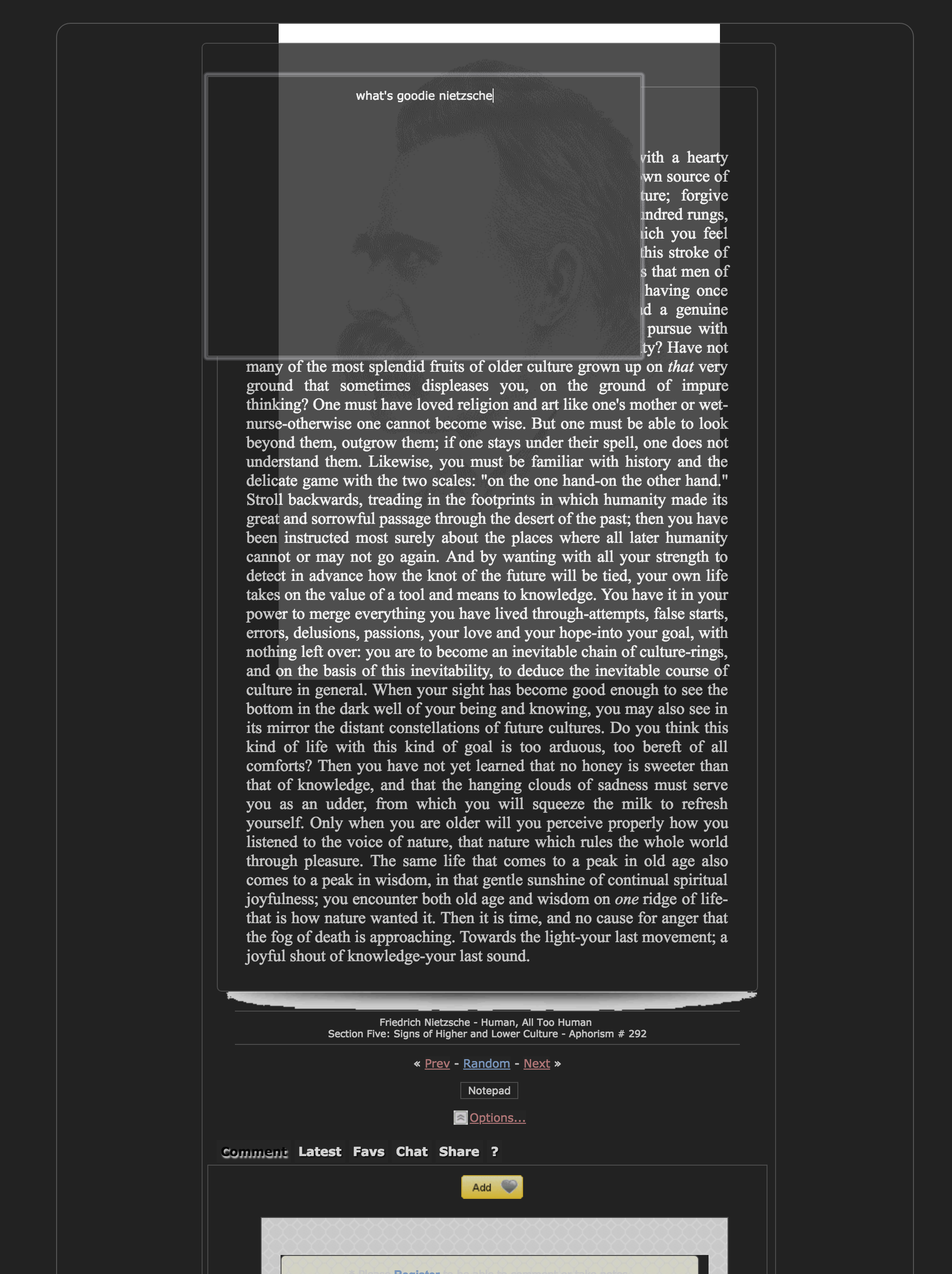
from this sick site that has a built in note taking widget, ratings, chat, and amaze design :~)
There is a rapid shifting of media: from printed paper to computer screens. This transition is modifying the process of how we read and understand text. The efficiency of reading is dependent on how ergonomically the visual information is presented. Font types and size characteristics have been shown to affect reading. A detailed investigation of the effect of the font type and size on reading on computer screens has been carried out by using subjective, objective and physiological evaluation methods on young adults. A group of young participants volunteered for this study. Two types of fonts were used: Serif fonts (Times New Roman, Georgia, Courier New) and Sans serif fonts (Verdana, Arial, Tahoma). All fonts were presented in 10, 12 and 14 point sizes. This study used a 6 X 3 (font type X size) design matrix. Participants read 18 passages of approximately the same length and reading level on a computer monitor. Reading time, ranking and overall mental workload were measured. Eye movements were recorded by a binocular eye movement recorder. Reading time was minimum for Courier New l4 point. The participants' ranking was highest and mental workload was least for Verdana 14 point. The pupil diameter, fixation duration and gaze duration were least for Courier New 14 point. The present study recommends using 14 point sized fonts for reading on computer screen. Courier New is recommended for fast reading while for on screen presentation Verdana is recommended. The outcome of this study will help as a guideline to all the PC users, software developers, web page designers and computer industry as a whole.
pretty cool tool and technically creative, you can make a little site where all data is then contained in the url generated. Here's the code (with some chars removed) for a frame.
<iframe
  src="https://itty.bitty.site/#Scripting/XQAAAAJXBwAAAAAAAAAeHMqHyTY4PyKmqfkwr6ooCXSIMxPQ7ojYR153HqZD3W+keVdvwyoyd+luwndzoLxdmwItTzdhlW/RlpwKcSTjgU0cmFK/XNlVfh/tSj+bkMJPSk6bm6A5pI4sBMlNECfMK6m9fdbElWXJDT/2lzPqQ=="
></iframe>
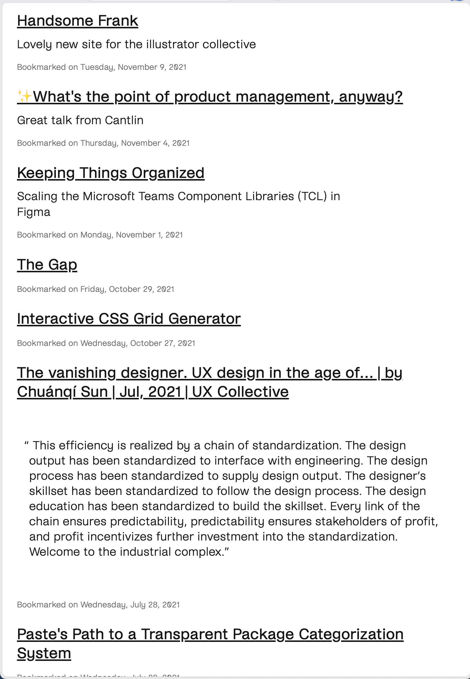
this blog and link collector of a typographer]
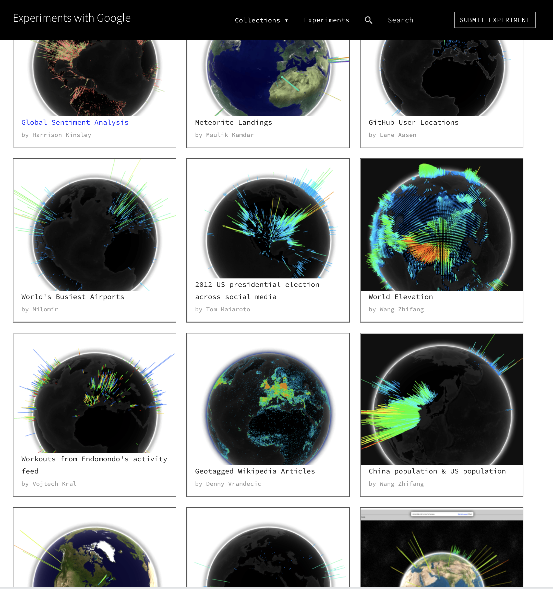
OK maybe not every single one, but most of em… look at this WebGL globe collection:
the colors layout ux… thinking of copying

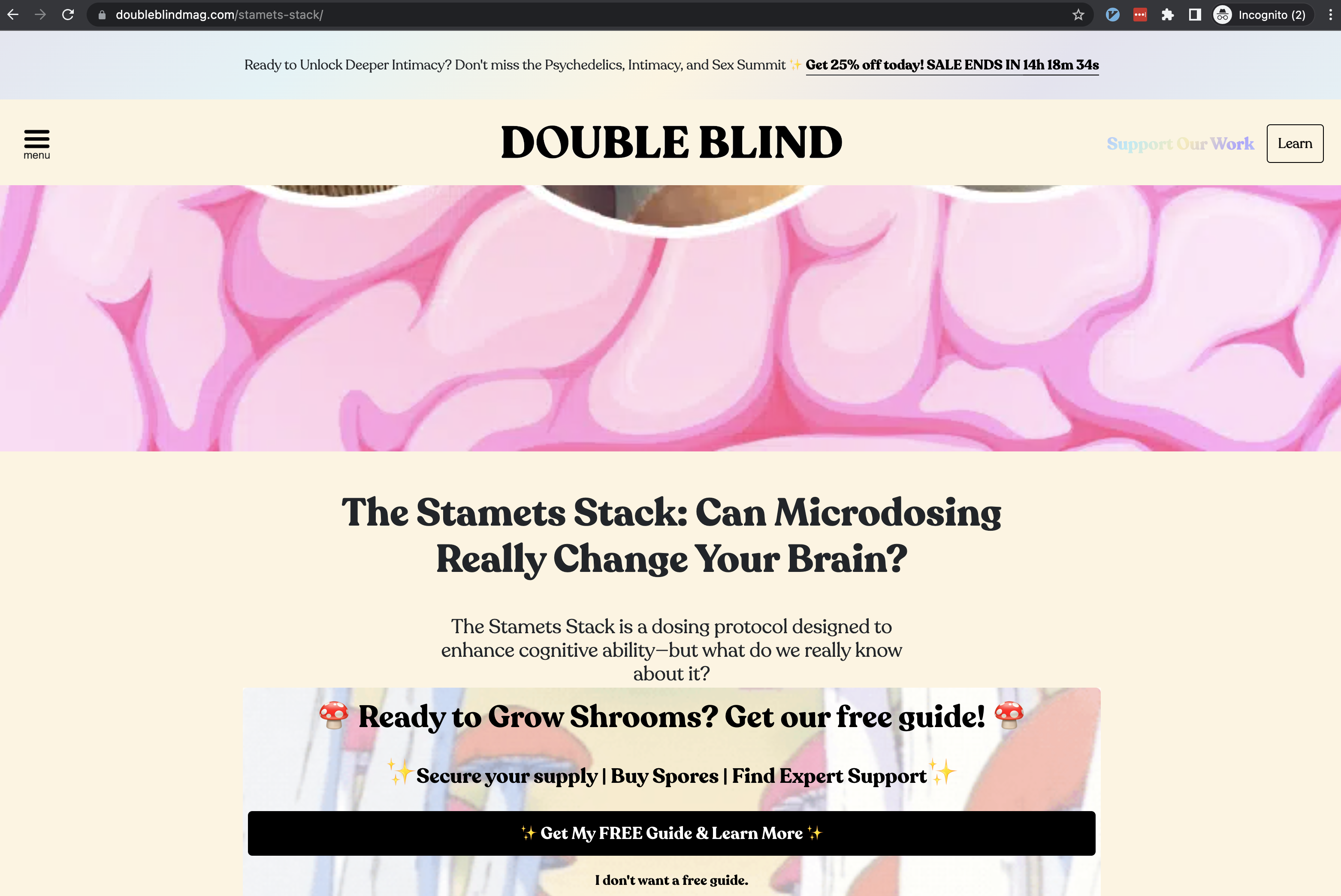
was watching Fantastic Fungi and came across this Paul Stamets character. Thought the design, font, colors, animations on double bling mag were pretty.
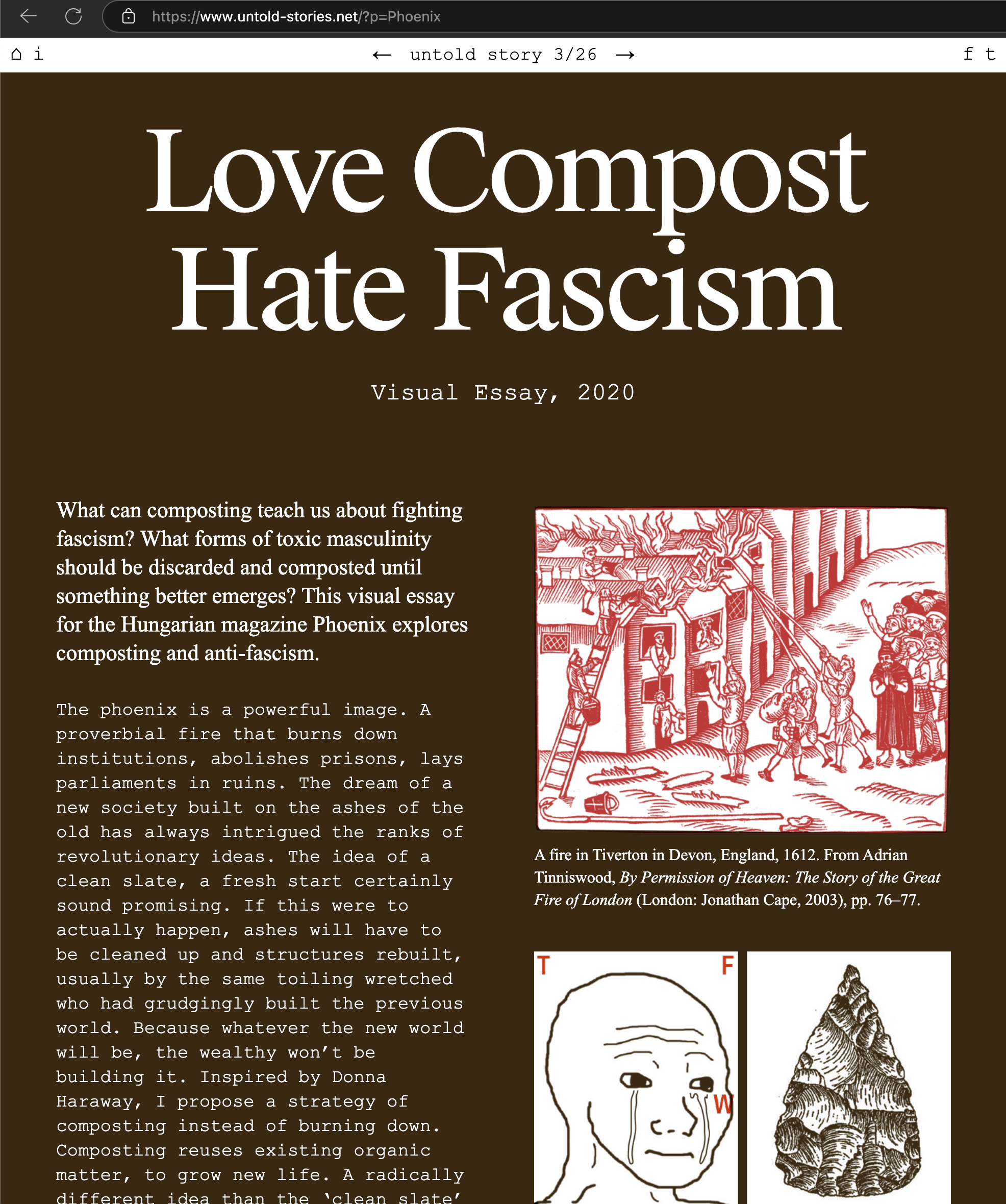
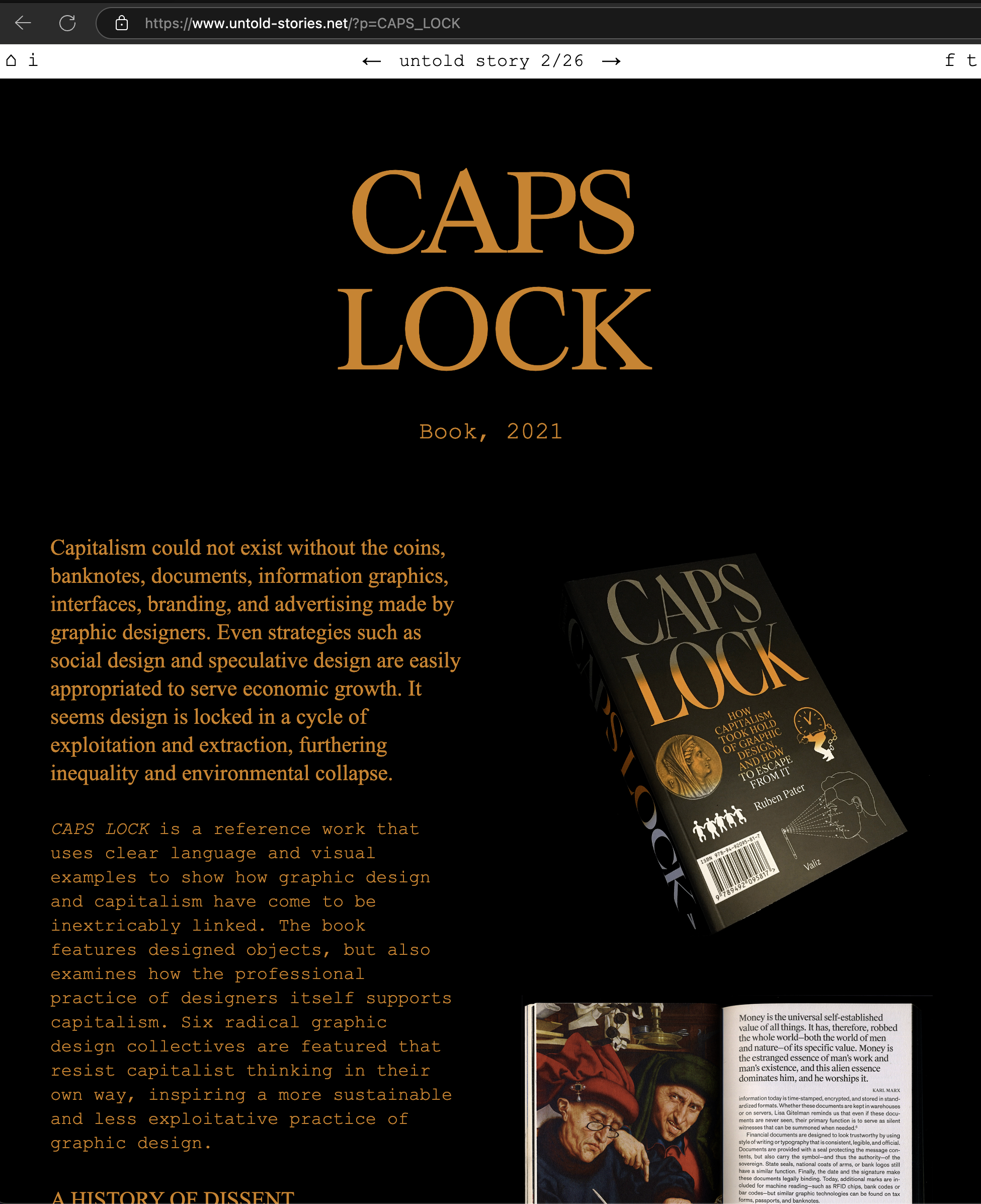
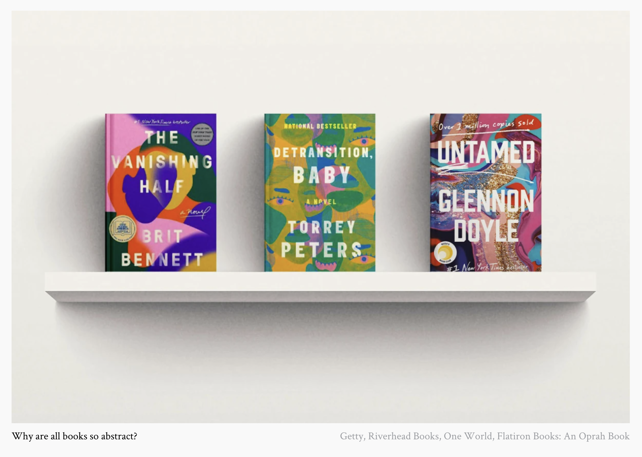
However pretty, this style seems to be metastasizing both online and off and reminds me of how every new book cover looks:
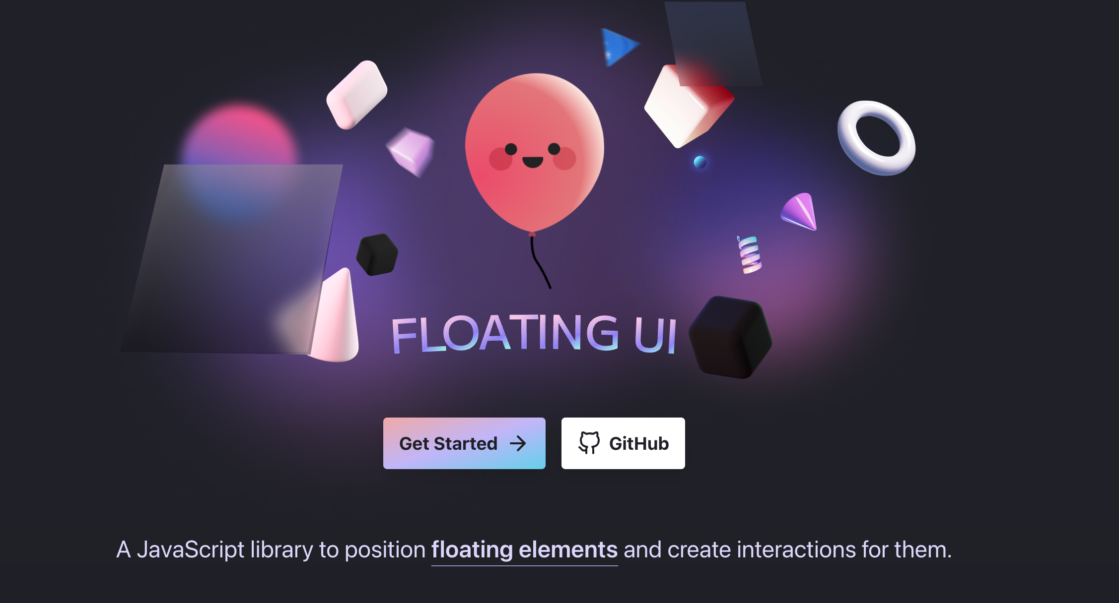
Was browsing github came across this lib whose documentation website has gorg lil floating blurred squares [https://floating-ui.com] around in the nav links. I personally love the frosted glass / hot shower glass door look:
OS housing design w/ CNC wikihouse.
https://www.axis-praxis.org/specimens/DEFAULT
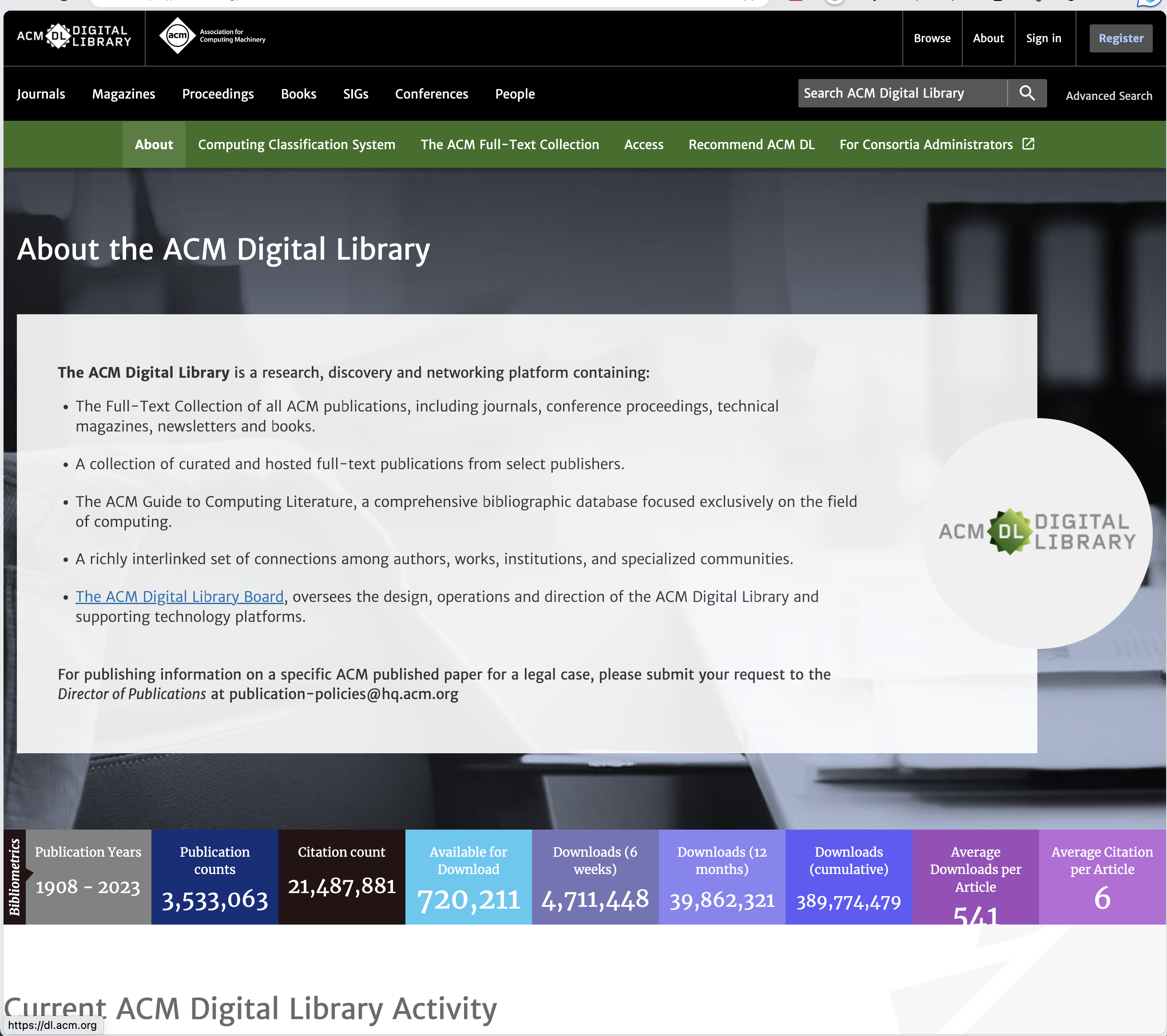
a big ole massive resource
eggsactly what is sounds like: 1001 free fonts
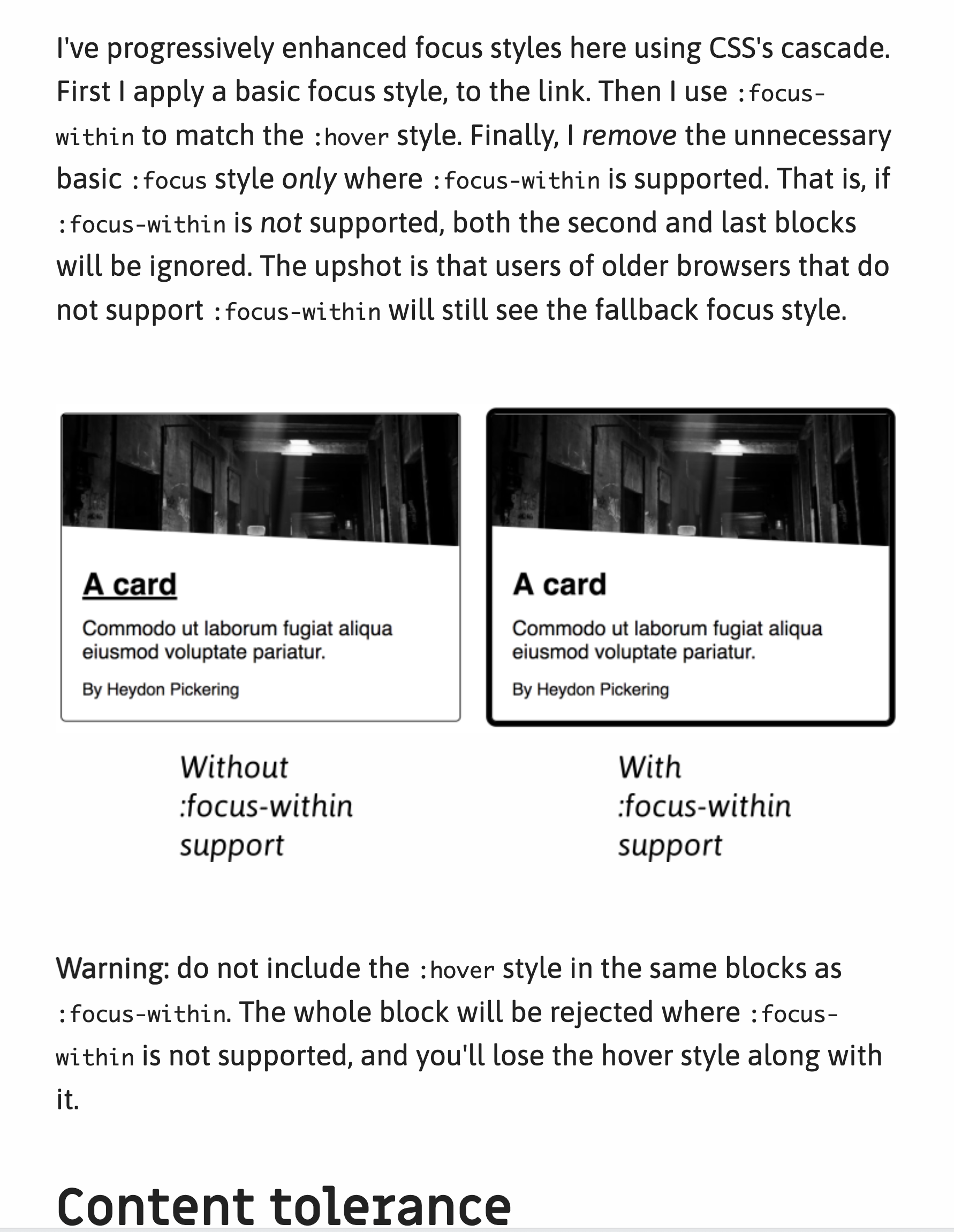
Check out this one about cards.
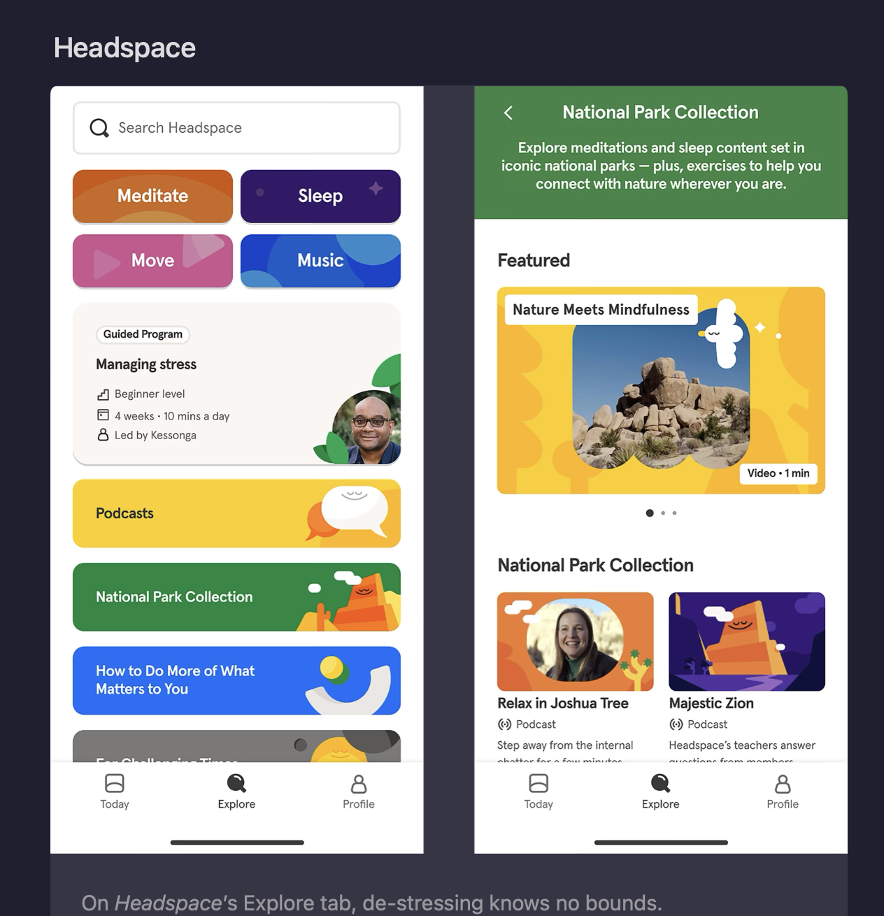
I wonder what we will think of this design in the past? Are all design trends just like fashion trends and we'll think of the frosted-glass effect as we do waterbeds and aquane? Design like Headspace's is really pretty to me but I can't help but think that it will bizarre in retrospect.
One of them is "Monokai Pirokai Beach Sunset":


Like what is happening over there—if you thought hyperlink clicking was an endless rabbit hole then you haven't pressed the "edit" or "read" button and clicked a few prolific profiles.

I have never been a fan of material design :weary:. It looks nice in the wild, but I always found it impossible to make a cohesive looking view using any of em. Maybe that still is the case. In any case, I like what colors they've chosen for these different callouts, asides, alerts etc:
